Quantcast
Viewing all 85 articles
Browse latest View live

Goobalathaldin Dick Roughsey: A legend in art and story

Dick Roughsey is well known to many Australians for his vividly illustrated children’s books The Rainbow Serpent and The Giant Devil Dingo – Jennifer Isaacs explores his life and work and offers her personal recollections of the artist, from his upbringing on Mornington Island to his pivotal role in the early years of the Australia Council.

Image may be NSFW.
Clik here to view.
Dick Roughsey showing his bark paintings at Karumba Lodge, 1963 / Image courtesy: Valerie Lhuede
Image may be NSFW.
Clik here to view.
Goobalathaldin Dick Roughsey, Lardil people, Australia 1924–85 / Untitled ND / Pigment on bark / 145 x 67cm / Donated by Ray Crooke through the Cultural Gifts Program, 2011 / Collection: Cairns Art Gallery / © Goobalathaldin Dick Roughsey/Copyright Agency, 2019

Dick Roughsey, also known as Goobalathaldin, was a Lardil artist from Mornington Island in the Gulf of Carpentaria. While his artistic practice had its origins in traditional bark painting, he later transitioned into modern paintings in oil and acrylic and became well known for his illustrated children’s books, winning the Children’s Book of the Year award twice during the late 1970s. His writing and art made him a pioneer cultural educator, and his book Moon and Rainbow (1971) was the first autobiography by an Indigenous Australian. He was appointed OBE in 1978.

Stay Connected: Subscribe to QAGOMA Blog

Image may be NSFW.
Clik here to view.
Goobalathaldin Dick Roughsey, Lardil people, Australia 1924–85 / Trezise. Roughsey at the caves 1970 / Oil on board / 28 x 36.5cm / Purchased 2012 / Collection: University of Queensland / © Goobalathaldin Dick Roughsey/Copyright Agency, 2019
Image may be NSFW.
Clik here to view.
Dick Roughsey sitting beside the tent in Percy Trezise’s camp, Cape York 1971 / Dick Roughsey stacking up newly cut bark for paintings, 1971 / Photographs: Jennifer Isaacs

I first met Dick in 1970, stepping out of a lift with his friend and fellow painter, Percy Trezise. Percy was an airline pilot, historian and documenter of Aboriginal rock art, and together he and Dick spent many years locating cave painting sites near Laura in Cape York, which Percy mapped with meticulous scale drawings. On this occasion they were arriving to present plans for the preservation of these cave paintings at a meeting of the Aboriginal Advisory Committee of the Australia Council for the Arts, chaired by Dr HC ‘Nugget’ Coombs. Following the successful 1967 Referendum, the Australian Government was looking to encourage and stimulate the arts of Aboriginal Australians through a range of policy initiatives designed to support all areas of cultural practice; this committee included the most outstanding Indigenous leaders in the arts, as well as academic advisers from disciplines ranging from music, dance, art and anthropology. Throughout this period, his peers included many Indigenous leaders who would come to be celebrated over the following decades as fighters for justice and champions of land rights.1 Dick had every reason to be confident of his stature among them and, in 1974, he would become the first Chair of the fully Indigenous Aboriginal Arts Board (under Prime Minister Gough Whitlam’s new larger Australia Council).

Image may be NSFW.
Clik here to view.
Percy Trezise and Dick Roughsey discuss a painting of the Rainbow Serpent with Prime Minister Gough Whitlam, 19 March 1975 / Collection: National Library of Australia / Photograph: Don Edwards/Australian Information Service
Image may be NSFW.
Clik here to view.
Xavier Herbert, Thancoupie, Percy Trezise and Dick Roughsey (with unknown, far left), c.1980s / Image courtesy: Jennifer Isaacs

In 1970s Sydney, Dick was a charming, warm, urbane presence. He was a frequent visitor to our menagerie of a household in Glebe, where a rolling number of itinerants stayed for both short and long periods, including many artists. Sometimes lonely, Dick came for the company, the food and a few beers — around the kitchen table, his jocular, raconteuring manner produced numerous larger-than-life tales of his exploits. He was particularly close with Dr Thancoupie Gloria Fletcher (Thanakupi), an artist from Weipa, who was also kin and became one of the country’s most respected ceramicists. Dick was older by 15 years, but they talked incessantly of their families. Thancoupie — whom Dick always called Gloria, or ‘my gel’ — listened eagerly to his updates on his wife Elsie and their six children on Mornington Island.

Dick was in his mid-forties at the time I met him, but these years in Sydney were a world away from where he grew up. After a fully self-sufficient hunting life on Mornington Island in his youth — surviving on turtle, shellfish, fishing and spearing game — Dick also worked on cattle stations at Tallawanta, Gregory Downs and Lorraine Station (where the food was so bad he took off on foot to Burketown and was police-escorted back to Mornington Island). He was a stockman and ringer, mustering, dipping, branding and droving long distances with pack horses. He was also an experienced deckhand on the Cora — which travelled across the Gulf to the east coast of the Northern Territory, Mornington Island, Aurukun and Weipa — and he enjoyed the open air and the smell of the sea.

Related: Goobalathaldin Dick Roughsey

Image may be NSFW.
Clik here to view.
Goobalathaldin Dick Roughsey, Lardil people, Australia 1924-1985 / Tribe on the move in the past, Cape York 1983 / Oil on board / 30 x 40cm / Gift of Simon, Maggie and Pearl Wright through the Queensland Art Gallery | Gallery of Modern Art Foundation 2015. Donated through the Australian Government’s Cultural Gifts Program / Collection: Queensland Art Gallery | Gallery of Modern Art / © Goobalathaldin Dick Roughsey/Copyright Agency, 2019

However, this was still the era Aboriginal people call the ‘Dog Act’ times; in order to leave Mornington Island to work on cattle stations, Dick needed a permit to leave — a ‘dog tag’.He mostly avoided this through misdeeds and purposely stealing cattle, hoping to be sent to Palm Island, from which he imagined he could run away. From the adventures he regaled us with, and from his autobiography, it is clear that his larrikin nature and determined personality repeatedly led him to try to escape island life — dominated by the mission — to a life offering greater and more exciting opportunities. But World War Two intervened, and his theft was forgiven by default when the cattle stations called for men in wartime and he was suddenly sent out to work them. During the war years, he also assisted in the location and recovery of wreckage and human remains from American planes that crashed in the Gulf. He married Elsie at the Presbyterian Church on Mornington Island in September 1944.

Throughout the 1950s, Dick worked on the mainland and also lived at the mission during the wet season. By 1960, he and his elder brother Lindsay (Burrud) began painting barks as well as carving utensils, spears and artefacts. Unlike Arnhem Land bark paintings, Lardil works were quite figurative, and primarily done in sequenced vignettes — like comic books — that told a cautionary tale or Creation story. These stories were well known to people of Dick’s age, but it concerned him that the younger generation ignored them. He frequently attached his own handwritten explanations on the back of the bark paintings.

Image may be NSFW.
Clik here to view.
Goobalathaldin Dick Roughsey, Lardil people, Australia 1924-1985 / Strange procession passing by (from ‘Jackey Jackey and Kennedy’ series) 1983 / Oil on board / 60 x 90cm / Gift of Barbara Blackman through the Queensland Art Gallery Foundation 1998 / Collection: Queensland Art Gallery | Gallery of Modern Art / © Goobalathaldin Dick Roughsey/Copyright Agency, 2019

Dick’s bark works featured ceremonial scenes relating to aspects of love magic (Djarada), flood, birth, initiation, burial practices and punishment for transgression of the laws. Realistic figures appear frozen in action but bear the full repertoire of Lardil body paint designs, wearing ceremonial hats, cockatoofeather head bands and woven arm bands. They are shown in silhouette or in profile, often in shake-a-leg dance position or poised ready to hurl weapons. The figures are arranged in tiers, sometimes with an inventory of Lardil artefacts and weapons.

In 1962, Dick was a yardman at the lodge in Karumba, the only town in Gulf Country that sits right on the coast — extensive tidal flats and shifting sands make other coastal settlement impossible in the region. As a pilot for Ansett, Percy Trezise often stopped overnight in Karumba on his route across the Gulf. The two men struck up a friendship through painting when the manager of the lodge commissioned Percy to paint a mermaid on the floor of the swimming pool. Percy would later become one of the strongest influences on Dick’s practice and career, and a catalyst for his journey into the mainstream art world. Percy particularly encouraged Dick to paint his own cultural knowledge and stories, rather than to try to emulate the work of Albert Namatjira, whose art was hugely popular and who was Dick’s personal hero.

Image may be NSFW.
Clik here to view.
Goobalathaldin Dick Roughsey, Lardil people, Australia 1924-1985 / The Birth of Goobalathaldin 1984 / Private collection / © Goobalathaldin Dick Roughsey/Copyright Agency, 2019

Dick and Percy began going on frequent camping trips on the Cape York Peninsula to paint and to map cave paintings in the sandstone escarpment. Dick’s consultations with traditional owners — particularly Willy Long, who lived in a corrugated tin-shack settlement a few miles from Laura — enabled him to record the mythological meanings of many of the cave images and to discuss the consistencies with his own Lardil stories. The Rainbow Serpent often featured in his paintings, along with the giant dog or dingo. When, on Percy’s advice, Dick turned to other media, he began exploring hunting images, with lyrical and romantic depictions of gathering firewood, hunting turtles, or swimming among the water lilies in blue lagoons.

Image may be NSFW.
Clik here to view.
Ray Crooke, Australia 1922–2015 / Portrait of Dick Roughsey 1996 / Oil on canvas / 84.4 x 113.5cm / Purchased by Cairns Regional Gallery, 1999 / Collection: Cairns Art Gallery / © Estate of Ray Crooke/Copyright Agency, 2019

Renowned artist Ray Crooke was another important mentor in Dick’s life, and Dick, Percy and Ray developed a tight camaraderie on their bush painting adventures. Crooke strongly influenced Dick with his advanced knowledge of oil painting technique, which is evident in Dick’s depictions of life vignettes using strong bodily form, rounded dark figures and sensuous tropical colour. Whereas Dick’s bark paintings were two-dimensional, his shift to working with oils and acrylics on Masonite or artists’ board introduced perspective both in the figures and in the landscape. The new medium enabled Dick to make thematic series portraying historical events, including the ill-fated 1848 expedition to the tip of Cape York by Edmund Kennedy and his Aboriginal guide, Jackey Jackey. As Percy’s son, Steve Trezise, observed while watching the men paint together: ‘Ray introduced the word chiaroscuro and kept saying, “More white, more white, mix it”, to assist Dick to achieve a middle ground in his landscape perspectives’.

Image may be NSFW.
Clik here to view.
Goobalathaldin Dick Roughsey and Percy Trezise / The next resting place was at Fairview where he decided to make another lily lagoon called Minalinka… (from ‘Rainbow Serpent Illustrations’) 1974 / Synthetic polymer paint / 25.4 x 48cm (framed) / Collection: Fryer Library, The University of Queensland Library / © Goobalathaldin Dick Roughsey/Copyright Agency, 2019. Estate of Percy Trezise

Dick moved to Cairns in 1964 and continued to produce enough work for his paintings to be exhibited in shows around the country.3 In the early 1970s, he began working in the genre he became best known for, the stories and vivid illustrations for his children’s books, including The Giant Devil Dingo (1973) and The Rainbow Serpent (1975). These were followed by a series relating to the Quinkan (spirit) figures in the cave art he was so familiar with, and other fearsome characters in the legends. Percy was integral to this work and he co-authored the later books in the series, which enraptured Australian school children for two decades and were among the first books to introduce Aboriginal culture to children.

Late in his life, Dick was badly afflicted by trachoma. This eye condition frustrated and worried him, and he painted less. As tastes in art, and specifically Indigenous art, swerved towards the new, modern, colourful acrylics of the desert, opportunities faded for sell-out shows of his work. To unaware new collectors, his paintings seemed folksy, naive or didactic. He returned to Mornington Island where he passed away from cancer in 1985.

Dick Roughsey’s pioneering life is an extraordinary and unique Australian story. He was one of ‘the first heroes’, an adventurer, a traveller between so many worlds — black and white, yet also mission and city, urban and village, and through the spiritual worlds of other ‘tribes’. He was brave and determined, yet also a very gifted artist who set high standards for others.

Jennifer Isaacs AM is a writer, art consultant and independent curator. She was made a Member of the Order of Australia in 2003 in recognition of her work promoting Aboriginal culture and assisting Aboriginal artists.

Endnotes
1 These included painter Wandjuk Marika, the protagonist in the first land rights case; poet, playwright and musician George Winungwidj; writer, poet and activist Kath Walker (Oodgeroo Noonucal); community leader and first Aboriginal subject of a published autobiography, Phillip Roberts; union leader Chicka Dixon; land rights campaigner Eddie Mabo; and writer Jack Davis.
2 The Aboriginals Preservation and Protection Act 1939 became known as the ‘Dog Act’ for its restrictions on human rights and freedoms. It prevented free movement, made possession or use of alcohol illegal, excluded ATSI people from voting rights and curtailed rights to own land and access justice. Under this law, people were settled away from their land by force, children were removed, certain marriages were forbidden and other injustices were perpetrated. On missions, the manager or superintendent determined suitable work and set the wage (usually low) and could seize property.
3 Exhibitions of Dick Roughsey’s work were held at various spaces during his career, including the Upstairs Gallery, Cairns; Artarmon Gallery, Wagner Art Gallery and Holdsworth Galleries, Sydney; Macquarie Galleries, Canberra; Australian Galleries, Melbourne; Bonython Gallery, Adelaide; and Anvil Gallery, Albury.

Subscribe to YouTube to go behind-the-scenes / Watch or Read about the Australian Collection

‘Goobalathaldin Dick Roughsey: Stories of this Land’ is a collaboration between Cairns Art Gallery and QAGOMA.

Acknowledgment of Country
The Queensland Art Gallery | Gallery of Modern Art (QAGOMA) acknowledges the Turrbal and Yugara (Jagera) peoples who are the traditional custodians of the land upon which the Gallery stands in Brisbane. We pay respect to Aboriginal and Torres Strait Islander elders past and present and, in the spirit of reconciliation, acknowledge the immense creative contribution Indigenous people make to the art and culture of this country.

It is customary in many Indigenous communities not to mention the name or reproduce photographs of the deceased. All such mentions and photographs are with permission, however, care and discretion should be exercised.

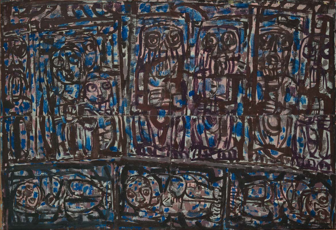
Feature image detail: Dick Roughsey Strange procession passing by (from ‘Jackey Jackey and Kennedy’ series) 1983

#DickRoughsey #QAGOMA


Copyright © 2008
This feed is for personal, non-commercial use only.
The use of this feed on other websites breaches copyright. If this content is not in your news reader, it makes the page you are viewing an infringement of the copyright. (Digital Fingerprint:
)
Image may be NSFW.
Clik here to view.

Autumn breezes fortified for an abundance of winters to come

QAGOMA conservators collaborated with specialist East Asian Art Conservator Jennifer Loubser to assess the conservation repairs necessary to stabilise an unusual 8-panel Japanese folding screen, Scenes from Genji Monogatari to allow its safe handling and display – in assessing the condition of the work when it came into the Collection it was found that hundreds of years of use and display had caused four sets of the delicate paper hinges connecting the three right panels to become weakened and in danger of becoming completely broken and detached.

Behind-the-scenes: Conservation of an 18th Century 8-panel Japanese folding screen

Image may be NSFW.
Clik here to view.

Image may be NSFW.
Clik here to view.
Tosa School, Japan / Eight-fold screen: Scenes from Genji Monogatari (Tale of Genji) 18th century / Ink and colour on silk on wooden framed screen with four pairs of metal hangers / 83 x 233cm (overall); 83 x 37.5cm (each panel) / Gift of James Fairfax AC through the Queensland Art Gallery | Gallery of Modern Art Foundation 2018 / Collection: Queensland Art Gallery | Gallery of Modern Art

Paper was an expensive item in Japan during the 18th century.  Among luxuries, paper appears to have been used sparingly in the delicate construction of this folding screen, perhaps to allow for a generous excess of chume sunago (flakes of gold leaf) throughout the painted silk surface, and surrounding kinran (gold thread silk borders). The graceful brush-work of the artist’s hand detailing dainty patterns in layers of the court ladies’ silk kimono garments adds an ornate appeal to this fine example of a koshi-byobu (waist-height folding screen).

Image may be NSFW.
Clik here to view.

This screen has survived in excellent condition for hundreds of years, as the tradition of seasonal displays is still strong in Japan. Rotating artworks provides rest and protection, so they too may live longer lives. Folding screens known as ‘byobu’, are constructed with the intention to provide a delightful continuous scene over a wide area, while creating privacy and shelter from drafts. The panels are connected by hinges made entirely of strong Japanese paper which can last a thousand years when well cared for. Through normal use folding and unfolding, paper hinges see the most wear and tear. These moving parts may need repairs or reconstruction after several hundred years. Displaying byobu standing in an accordion pattern allows them to be free-standing and also protects screens from being overextended. If folding screens are displayed completely flat their hinges can begin to strain and tension may be exerted across the painted surface.

Image may be NSFW.
Clik here to view.
Lifting hinges (Before Conservation)
Image may be NSFW.
Clik here to view.
Repaired hinges (After conservation)
Image may be NSFW.
Clik here to view.
Conservator Jennifer Loubser re-attaching detached kinpaku gold leaf hinge papers

This folding screen was stabilised just in time, before the failing hinges began to cause splits across the paintings. Weakened with use over centuries, hinges had torn apart from the adjacent panels. Gold leaf had delaminated from single-layer paper hinges. It was crucial to support these frail connections with museum quality Japanese handmade paper sub-hinges. Traditional Japanese art conservation methods and materials including plant-based watercolours and pure gold pigments to infill loss areas were used in continuity with the original artist materials. The autumn story depicted in this painting has now been fortified with strength to weather an abundance of seasons ahead.

Image may be NSFW.
Clik here to view.
Detached Hinge (Before Conservation)
Image may be NSFW.
Clik here to view.
Supported Hinge (During Conservation)
Image may be NSFW.
Clik here to view.
Upper Hinge Re-Attached (After Conservation)

Related: A Fleeting Bloom Read about necessary conservation repairs to stabilise works in the exhibition

Stay Connected: Subscribe to QAGOMA Blog Be the first to go behind-the-scenes at exhibitions and events and hear stories from exhibiting artists.

This 8-panel folding screen is now standing proudly in the Queensland Art Gallery as part of  ‘A Fleeting Bloom’. The stunning display of antique Japanese artworks in the exhibition are fine examples of delicate artistic rendition and quality materials. I highly recommend seeing these in person if you enjoy spending time with refined details and aesthetics of splendid open spaces.

Jennifer Loubser is an East Asian Art Conservator

Before and After Conservation

Image may be NSFW.
Clik here to view.
Detached Hinge, (Before Conservation)
Image may be NSFW.
Clik here to view.
Supported Hinge (During Conservation)
Image may be NSFW.
Clik here to view.
Lower Hinge Re-Attached (After Conservation)
Image may be NSFW.
Clik here to view.
Reverse hinges, detached (Before conservation)
Image may be NSFW.
Clik here to view.
Reverse hinges re-attached (After Conservation)
Image may be NSFW.
Clik here to view.
Detail of arame sunago, large gold leaf flaked paper
Image may be NSFW.
Clik here to view.
Detached gold leaf hinge (Before conservation)
Image may be NSFW.
Clik here to view.
Detached gold leaf hinge (After conservation)
Image may be NSFW.
Clik here to view.
Detached gold leaf hinge (Before conservation)
Image may be NSFW.
Clik here to view.
Detached gold leaf hinge (After conservation)

Subscribe to YouTube to go behind-the-scenes / Watch art conservation secrets revealed / Read more about conserving your collection

Learn more about Traditional Japanese Art Conservation in Australia

Caring for Japanese folding screens: Free-Sackler Conservators demonstrate Safe Handling for Japanese folding screens

Feature image detail: Tosa School Eight-fold screen: Scenes from Genji Monogatari (Tale of Genji) 18th century

#QAGOMA


Copyright © 2008
This feed is for personal, non-commercial use only.
The use of this feed on other websites breaches copyright. If this content is not in your news reader, it makes the page you are viewing an infringement of the copyright. (Digital Fingerprint:
)
Image may be NSFW.
Clik here to view.

Margaret Olley: So much herself

Christine France offers her personal reflections on Margaret Olley’s life, work and her generous spirit. Visit the Gallery of Modern Art (GOMA) until 13 October 2019 to view the free exhibition ‘Margaret Olley: A Generous Life’, which examines the legacy and influence of one of Australia’s most beloved artists, a charismatic character whose life was immersed in art.

Image may be NSFW.
Clik here to view.
Lewis Morley, Hong Kong/England/Australia 1925–2013 / Portrait Margaret Olley 1998 / Gelatin silver photograph / 24.1 x 36.6 cm / Gift of the artist 2003. Donated through the Australian Government’s Cultural Gifts Program / Collection: National Portrait Gallery, Canberra / © Lewis Morley/ National Science & Media Museum/ Science & Society Picture Library
Image may be NSFW.
Clik here to view.
Greg Weight, Australia b.1946 / Portrait Margaret Olley 1991 / Gelatin silver photograph / 36.2 x 45.3cm / Gift of Patrick Corrigan AM 2004 / Donated through the Australian Government’s Cultural Gifts Program / Collection: National Portrait Gallery, Canberra / Image reproduced courtesy of Greg Weight / © Greg Weight

Related: Margaret Olley

Stay Connected: Subscribe to QAGOMA Blog

I think ‘a generous life’ is spot on. Margaret was generous in her friendships, extraordinarily generous. Later on in life, when she could afford it, she was generous with gifting things to institutions. She reached out to friends, would pay their fares to places and publish books for them… Margaret had some very early experiences of giving which served as examples to her. Early on in her career she met Howard Hinton… He would buy paintings, hang them end to end on his bedroom wall, and store them under his bed. Later, he gifted them all to the Teacher’s College in Armidale.1 He set a very strong example for Margaret.

Ethel Carrick Fox

Image may be NSFW.
Clik here to view.
Ethel Carrick Fox, England/France/Australia 1872–1952 / On the beach c.1909 / Oil on canvas / 36 x 42cm / Gift of the Margaret Olley Art Trust through the Queensland Art Gallery | Gallery of Modern Art Foundation 2011 / Collection: Queensland Art Gallery | Gallery of Modern Art

Margaret Cilento

Image may be NSFW.
Clik here to view.
Margaret Cilento, Australia 1923-2006 / The immigrants 1951, reworked 1952 / Oil on board / 98 x 120cm / Gift of the Margaret Olley Art Trust 1993 / Collection: Queensland Art Gallery | Gallery of Modern Art / © QAGOMA

She learnt another lesson about being generous when she went to England. She missed out on the travelling art scholarship, but her friend Anne Wienholt, who’s another Queenslander, sent her the money to go. Olley never ever forgot that. When she was overseas, she’d be admiring a painting, look at the plaque beside it and say, ‘Oh, it was donated by someone’. She thought it was a really wonderful thing to have done. So as soon as she got a bit of money, she started donating to public institutions, and the first thing she bought was Anne Wienholt’s bronze sculpture The medium 1984, which she gave to the Art Gallery of New South Wales in 1988.2

Christine France OAM Curator and author

Endnotes
1 These works are now held in the New England Regional Art Museum Collection.
2 Anne Wienholt, The medium 1984, Gift of Margaret Olley 1988, Art Gallery of New South Wales, Sydney.

An extract from Margaret Olley–A Generous Life, Queensland Art Gallery | Gallery of Modern Art, Brisbane, 2019. Read in full Simon Elliott and Christine France, ‘So much herself: A conversation about Margaret Olley’ pp. 178-195.

Pablo Picasso

Image may be NSFW.
Clik here to view.
Pablo Picasso, Spain 1881-1973 / Le Repas frugal (The frugal meal) (from ‘La Suite des Saltimbanques’ series) 1904, printed 1913 / Etching and scraper on Van Gelder Zonen wove paper / 46.4 x 37.8cm (comp.) / Purchased 2015 with funds from the Margaret Olley Art Trust through the Queensland Art Gallery | Gallery of Modern Art Foundation / Collection: Queensland Art Gallery | Gallery of Modern Art / © Pablo Picasso/Succession Picasso. Licensed by Copyright Agency, 2015

Georges William Thornley after Edgar Degas

Image may be NSFW.
Clik here to view.
Georges William Thornley, Lithographer, 1857-1935/ after Edgar Degas, Artist, France 1834-1917 / Le Bain (The bath) c.1888, published 1889 (in ‘Quinze lithographies d’après Degas’ (Paris: Boussod & Valadon)) / Crayon manner lithograph (from transfer paper); printed in red/brown ink on paper (chine collé), laid down on green paper backing sheet / 20.3 x 20.2cm (comp.) / Gift of the Margaret Olley Art Trust through the Queensland Art Gallery | Gallery of Modern Art Foundation 2012 / Collection: Queensland Art Gallery | Gallery of Modern Art

Edgar Degas

Image may be NSFW.
Clik here to view.
Edgar Degar, France 1834-1917 / Three views of Danseuse regardant la plante de son pied droit, quatrième étude (Dancer looking at the sole of her right foot, fourth study) c.1882-1900, cast before 1954 / Bronze, dark brown and green patina / 46.2 x 25 x 18cm / Gift of Philip Bacon AM, in memory of Margaret Olley AC, through the Queensland Art Gallery | Gallery of Modern Art Foundation 2012. Donated through the Australian Government’s Cultural Gifts Program / Collection: Queensland Art Gallery | Gallery of Modern Art

Subscribe to YouTube to go behind-the-scenes / Read more about your Australian Collection

Buy the publication

Feature image: Margaret Olley and William Dobell in ‘Painting People’ 1965 in front of William Dobell’s 1948 Archibald Prize–winning portrait of Olley / Still supplied by the National Film and Sound Archive of Australia’s Film Australia Collection / © NFSA

#MargaretOlley #OlleyGOMA #QAGOMA


Copyright © 2008
This feed is for personal, non-commercial use only.
The use of this feed on other websites breaches copyright. If this content is not in your news reader, it makes the page you are viewing an infringement of the copyright. (Digital Fingerprint:
)
Image may be NSFW.
Clik here to view.

Margaret Olley: Her works reflect her personality perfectly

Renowned Australian artist William Robinson offers his personal reflections on Margaret Olley’s life, art practice, and his fond memories of visiting Olley in her home is Sydney, visit the Gallery of Modern Art (GOMA) until 13 October 2019 to view the free exhibition ‘Margaret Olley: A Generous Life’, whch examines the legacy and influence of one of Australia’s most beloved artists, a charismatic character whose life was immersed in art.

Image may be NSFW.
Clik here to view.
Lewis Morley, Hong Kong/England/Australia 1925–2013 / Portrait Margaret Olley 1998 / Gelatin silver photograph / 24.1 x 36.6 cm / Gift of the artist 2003. Donated through the Australian Government’s Cultural Gifts Program / Collection: National Portrait Gallery, Canberra / © Lewis Morley/ National Science & Media Museum/ Science & Society Picture Library

I used to go around and see her at Paddington in Sydney. Her house was more or less just a subject for her continual group of paintings. There never seemed to be anything that was actually finished — it was always in flux — some piled up with hardly a start, others three quarters finished. She had flower arrangements like still lifes dying on the table and fruit rotting all over the place. It was almost like a party when you brought some fresh cut flowers for her, because [the ones she had] were already dead. I remember she had her big lounge chair piled up with stuff and nobody could sit on it. She had a lithograph by Cézanne — Bathers, I think it was — and a little drawing of Bonnard’s, and all of her Indian and Eastern sculpture and mats everywhere. There was hardly any room to walk.

The re-creation of her home at the Tweed Regional Gallery is a lovely lasting tribute to her, but it is nowhere near as untidy as Margaret’s place really was! William Robinson

Image may be NSFW.
Clik here to view.
Greg Weight, Australia b.1946 / Portrait Margaret Olley 1991 / Gelatin silver photograph / 36.2 x 45.3cm / Gift of Patrick Corrigan AM 2004 / Donated through the Australian Government’s Cultural Gifts Program / Collection: National Portrait Gallery, Canberra / Image reproduced courtesy of Greg Weight / © Greg Weight
Image may be NSFW.
Clik here to view.
R. Ian Lloyd, Canada/Australia b.1953 / Margaret Olley in her studio in Sydney, New South Wales, Australia at 9:22am on December 13th, 2005 2005, printed 2009 / Gift of the artist through the QAGOMA Foundation 2010. Donated through the Australian Government’s Cultural Gifts Program / Collection: QAGOMA / © R. Ian Lloyd.

Related: Margaret Olley

Stay Connected: Subscribe to QAGOMA Blog for the latest exhibition announcements, be the first to go behind-the-scenes, and hear stories from artists and more.

I have always thought of Margaret as a very accomplished painter. She painted loosely and freely but she was always representational in her painting. Her works reflect her personality perfectly and I can’t imagine Margaret painting any other way. Shirley and I used to take her paint, too. Margaret wasn’t always using artist-quality paint, so we’d take her the odd tube of good paint, like Winsor & Newton cobalt violet and the carmines. Her eyes would light up when she saw colours like that!1

William Robinson AO is an Australian painter and lithographer. He has won the Archibald Prize for portraiture in 1987 and 1995 and also the Wynne Prize for landscape painting in 1990 and 1996.

Endnote
1 Interview between William Robinson and Simon Elliott, January 2019

Image may be NSFW.
Clik here to view.

Image may be NSFW.
Clik here to view.

Image may be NSFW.
Clik here to view.
The re-creation of Margaret Olley’s Duxford Street house at the Tweed Regional Gallery / Photographs: Natasha Harth © QAGOMA

Buy the publication

Subscribe to YouTube to go behind-the-scenes / Read more about your Australian Collection

Feature image detail: Margaret Olley in her studio in Sydney, New South Wales, Australia at 9:22am on December 13th, 2005

#OlleyGOMA #MargaretOlley #QAGOMA


Copyright © 2008
This feed is for personal, non-commercial use only.
The use of this feed on other websites breaches copyright. If this content is not in your news reader, it makes the page you are viewing an infringement of the copyright. (Digital Fingerprint:
)
Image may be NSFW.
Clik here to view.

Shirley Macnamara: Respect, balance and belonging

Indjalandji artist Shirley Macnamara weaves the Queensland desert landscape into the very fabric of her work, creating exquisite sculptural forms and vessels from spinifex and other natural materials. Anneke Silver offers a personal reflection on the artist’s practice and explores how her works evoke both the resilience and the colours of the environment they spring from.

Shirley Macnamara: Dyinala, Nganinya’ is at the Queensland Art Gallery from 21 September 2019 – 1 March 2020. The exhibition highlights Macnamara’s unique sculptural pieces crafted from the spinifex plant and its runner roots.

Our old people used to say ‘Dyinala’ meaning by and by; wait, have patience, all things will work out in time. ‘Nganinya’ meaning this way – for me this means making my art this way, which is my way. Shirley Macnamara

Image may be NSFW.
Clik here to view.

Image may be NSFW.
Clik here to view.
A prototype for Fenced in 2014 at Shirley Macnamara’s studio, Mount Guide, and the finished work installed at the Parish Church of St Joan of Arc, Brighton, Victoria / © Shirley Macnamara

My car churns up a plume of red dust: a rich, earthy red, the colour of the land all around. It extends as far as the eye can see, covered in spiky clumps of spinifex, like giant porcupines in grey-greens and dry yellows. Their edges catch the light, giving them golden haloes. On the horizon, blue-violet mountain ranges shimmer in the midday heat. Amid all of this is Mount Guide Station, Shirley Macnamara’s family-run property south of Mount Isa. Shirley comes out to greet me with her lovely smile, observant eyes and the walk of someone who was born in the saddle. Artist and cattle woman, Shirley belongs to Indjalandji country, not far from here.

Outback hospitality prevails. Guests can choose between sleeping in the homestead or the wrought iron bed in the paddock, where you can roll out your swag and sleep in utter silence under a star-studded sky. During such a night you gain just an inkling of what it means to Aboriginal people to be ‘on country’. Everything has a palpable presence — alive with a pulse and energy. It is in this environment that Shirley spent her childhood, roaming the country — often on horseback — swimming in waterholes, gathering bush foods and learning to read animal tracks and build a shelter.

She tells me that her father was a highly respected stockman in the region and an honoured man in a language group from the area near Lake Nash, a different language group from her mother’s. Her father taught her rope making, mustering and other cattle skills. The family, including her maternal grandmother, lived by themselves at an outstation at Barkly Downs. This was her grandmother’s country; it is from her that Shirley gained her extensive knowledge of her ancestors’ culture.

Stay Connected: Subscribe to QAGOMA Blog for the latest exhibition announcements, be the first to go behind-the-scenes, and hear stories from artists, and more.

Image may be NSFW.
Clik here to view.
Shirley Macnamara working on spinifex vessels in her outdoor studio, Mount Guide Station, Mount Isa / Photograph: Virginia Hills

Shirley and her late husband Nat purchased Mount Guide Station after several years droving with their young children, having previously owned a smaller property.

The station is relatively close to her maternal country, and Shirley recalls in detail the ancestral knowledge passed on by her grandmother, an important law woman who knew the songs and dances connected to place. But her grandmother was secretive about this knowledge, because of the invaders’ insidious efforts to erase all traces of both the culture and the people themselves. There was the Stolen Generation — and Australia’s massacre map includes many dots in the north. From her grandmother and mother she learnt about respect for country and the notion of balance, not taking more than you need. To look after the land, to leave enough for it to regenerate. Because the land will look after you — so you belong.

Shirley and I met through Flying Arts (the EastAus Art School, as it was then called), the brainchild of artist Mervyn Moriarty. He and similar minded artists flew around the outback giving seminars and workshops in visual art. These were seminal courses and created opportunities for serious discussion about contemporary art and experimental practice. The practices of many regional artists were fostered by these encounters. Shirley herself said that Flying Arts taught her that ‘there are no limitations to one’s creativity’.1 In need of a more suitable venue, the workshops later moved from Mount Isa’s Flying Doctor base to Mount Guide Station, where the wrought iron bed became a favourite. It became the ‘50 000 star’ accommodation, and the subject of a lino print edition by one of the participants.2

It was at a Flying Arts conference at Lake Julius in 1994, organised by artist Kim Mahood, where I first met Shirley. She had brought in her bundle of red and yellow ochre spinifex runners, having discovered that the outer skin of the long runners could be peeled away to reveal the coloured inner strands. I remember Shirley’s strong, elegant hands stroking the strands the way you would stroke a granddaughter’s hair; there was such love in her gestures and such respect for the material. Other participants and tutors, including artist Tracey Moffatt, showed great enthusiasm and encouraged Shirley to work with the strands. She and her friend Jill O’Sullivan, who discovered they both liked art after casually meeting at a festival in town, had painted miniature landscapes together for some years.3 Flying Arts presented them both with new possibilities.

Image may be NSFW.
Clik here to view.
Shirley Macnamara, Indjalandji/Alyawarr, Australia b.1949 / Spinifex vessel, bowl 1998 / Twined spinifex runner roots vessel lined with yellow ochre, including 5 pieces of yellow ochre / 25 x 41 x 38cm / Purchased with funds from the Visual Arts Craft Board of the Australia Council, 1998 / Collection: City of Townsville Art Collection / © Shirley Macnamara
Image may be NSFW.
Clik here to view.
Shirley Macnamara / Guutu (vessel) 14 2001 / Woven spinifex (Triodia pungens), emu feathers, nylon thread and synthetic polymer fixative / 24.3 x 22.5 x 21cm / Purchased 2002. Queensland Art Gallery Foundation Grant / Collection: Queensland Art Gallery | Gallery of Modern Art, Brisbane / © Shirley Macnamara
Image may be NSFW.
Clik here to view.
Shirley Macnamara / Skullcap 2013 / Spinifex, emu feathers and ochre / 12 x 24 x 23cm (oval) / Purchased 2016 / Collection: The University of Queensland, Brisbane / © Shirley Macnamara

Shirley’s earliest spinifex works were baskets, beautifully shaped with the same love and respect as when she first showed us how to peel the strands. Other objects followed, but vessels remained the mainstay of her practice. Containers — baskets, buckets — are important in all cultures. We use them as metaphors and put things ‘in the too hard basket’ or ‘on our bucket list’. It is important to muse over Shirley’s baskets; the materials, their shape and what meanings they may suggest. Some are strong, densely woven and lined with ochre clay, evoking both the resilience and the colours of the environment they spring from. By contrast, the mourning caps, with their soft grey emu feathers, show sombre vulnerability. Others seem ready for a ceremony, bristling with joyful colours.

Image may be NSFW.
Clik here to view.
Shirley Macnamara / Bush fascinator 2013 / Spinifex with crimson wing feathers / 17 x 43 x 17cm / Purchased with the assistance of the Cairns Regional Gallery Foundation, 2014 / Collection: Cairns Art Gallery / © Shirley Macnamara
Image may be NSFW.
Clik here to view.
Shirley Macnamara, artist, Indjalandji/Alyawarr / Australia b.1949 / Nathaniel Macnamara, assistant, Indjalandji/Alyawarr, Australia b.2004 / Cu 2016 / Hand-coiled copper wire and raw copper / 22 x 25 x 25cm / Purchased 2017 with funds from Gina Fairfax through the Queensland Art Gallery I Gallery of Modern Art Foundation / Collection: Queensland Art Gallery | Gallery of Modern Art, Brisbane / © Shirley Macnamara

Shirley lets the material guide the shape of each form. She collects bones, echidna quills, feathers, wire and copper ore from an abandoned mine on the property, materials with stories and memories attached. Woven into objects, they tell tales of life, decay, intrusion and regeneration. Some — her bush fascinators, for example — are as mad as a galah on fermented flowers. And then there are the crosses, a powerful symbol in Western culture, often used as an excuse to incarcerate Indigenous people, to separate them from their own tradition. In contrast to the natural materials of the sculptural shelter, which is made from turpentine shrub, the wire crosses suggest fences and imprisonment.

Many objects have a sturdy exterior with something soft and beautiful, such as pink feathers, inside. They speak of vulnerability and protection. I often wonder if unconsciously, or perhaps consciously, Shirley is urging us to be mindful and protective, and to take care of our precious natural environment — to have a sense of balance, and respect for the land — so that we, too, can belong.

Dr Anneke Silver is a prominent north Queensland artist and was Associate Professor of Visual Art at James Cook University until 2006. She has presented more than 40 solo exhibitions and also has countless group and invitation shows to her name.

Endnotes
1 Shirley Macnamara, quoted in Marilyn England, From River Banks to Shearing Sheds: Thirty Years with Flying Arts 1971–2001, MPhil thesis, University of Queensland, 2007.
2 Anneke Silver, personal diaries, 1994–98.
3 Phone conversation with Jill O’Sullivan, 8 June 2019.

Image may be NSFW.
Clik here to view.

Image may be NSFW.
Clik here to view.
Shirley Macnamara / Wingreeguu (and detail) 2012 / Spinifex (Triodia pungens), turpentine bush (Acacia lysiphloia), yellow ochre / 190 x 241 x 160cm / Commissioned for APT7. Purchased 2013. Queensland Art Gallery Foundation Grant / Collection: Queensland Art Gallery | Gallery of Modern Art / © Shirley Macnamara

Buy the publication

Subscribe to YouTube to go behind-the-scenes / Hear stories told by artists / Read more about your Australian Collection

Acknowledgment of Country
The Queensland Art Gallery | Gallery of Modern Art (QAGOMA) acknowledges the traditional custodians of the land upon which the Gallery stands in Brisbane. We pay respect to Aboriginal and Torres Strait Islander elders past and present and, in the spirit of reconciliation, acknowledge the immense creative contribution Indigenous people make to the art and culture of this country. It is customary in many Indigenous communities not to mention the name or reproduce photographs of the deceased. All such mentions and photographs are with permission, however, care and discretion should be exercised.

Feature image: Shirley Macnamara, Indjalandji/Alyawarr, Australia b.1949 / Erkel (vessel) 2010 / Twined spinifex (Triodia pungens), red ochre, galah feathers, nylon thread and synthetic polymer fixative / 14 x 31 x 25cm / Purchased 2010 with funds from the Bequest of Grace Davies and Nell Davies through the Queensland Art Gallery Foundation / Collection: Queensland Art Gallery | Gallery of Modern Art, Brisbane / © Shirley Macnamara

#MacnamaraQAG #ShirleyMacnamara #QAGOMA


Copyright © 2008
This feed is for personal, non-commercial use only.
The use of this feed on other websites breaches copyright. If this content is not in your news reader, it makes the page you are viewing an infringement of the copyright. (Digital Fingerprint:
)
Image may be NSFW.
Clik here to view.

Ian Fairweather: Life lines

The QAGOMA Research Library holds a collection of letters, photographs and other memorabilia relating to the famously reclusive artist Ian Fairweather, who spent the last two decades of his life in a hut on Bribie Island. A new book Ian Fairweather: A Life in Letters from Text Publishing compiles several hundred of Fairweather’s letters, which chart a remarkable and poignant life, writes Claire Roberts.

Join us at GOMA for the book launch

Image may be NSFW.
Clik here to view.
Page from the album of Ethel Fairweather showing a photograph of her brother Ian; pressed flowers; a line from a poem by John Milton; and a photograph of the island of Sark, where the Fairweather family holidayed / Collection: QAGOMA Research Library / © QAGOMA

Writing to the artist William Frater from Sandgate in October 1938, Ian Fairweather (1891–1974) remarked that life was not long enough for working and painting: ‘I must just paint and hope — one can’t be two things at once’.1 Fairweather’s peripatetic life, including extended periods living in China, Bali and the Philippines, may be best understood as part of his questing to find a conducive place in which to live and paint. Fairweather spent the last two decades of his life on Bribie Island where he created majestic paintings, mostly at night by kerosene lamplight, in his studio-house — a fit-for-purpose structure built from bush materials with an earth floor. After his visit in July 1969, James Gleeson described the house as being ‘like a great bird’s nest’.2 Today, Fairweather’s paintings hang in national and state galleries across the country and can be found in the private collections of many artists and writers. Virtually forgotten in the United Kingdom, he has become one of Australia’s most important and enduring artists, admired for works of art that are imbued with a strong psycho-spiritual dimension.

RELATED: Ian Fairweather

SIGN UP NOW: Subscribe to QAGOMA Blog for the latest announcements, recent acquisitions, behind-the-scenes features, and artist stories.

Image may be NSFW.
Clik here to view.
Ian Fairweather, Epiphany 1962
Ian Fairweather, Scotland/Australia 1891-1974 / Epiphany 1962 / Synthetic polymer paint on four sheets of cardboard on composition board / 139.6 x 203.2cm / Purchased 1962 / Collection: Queensland Art Gallery | Gallery of Modern Art / © Ian Fairweather/Licensed by Copyright Agency

In his middle and later years, when Fairweather was not painting, he was building houses (six in total), reading books and magazines, translating Chinese texts into English or writing letters to friends and family members, an activity that attests to his sociability and desire for managed human contact. Ian Fairweather: A Life in Letters, edited with John Thompson, assembles half of the known letters written by Fairweather. Spanning the period from 1915 when he was a prisoner of war in Germany, through to his death on Bribie Island in 1974, the letters chart a remarkable and poignant life. The 354 letters provide glimpses into Fairweather’s childhood and upbringing in the United Kingdom, war time experience and incarceration in Germany as a POW, study at the Slade School of Fine Art, years of travel in Asia, love of tropical islands, and his complex relationship with Australia, described by him as the ‘never never land’.

Image may be NSFW.
Clik here to view.
Photograph from the album of Ethel Fairweather, including a portrait of Ethel, c.1903 / Collection: QAGOMA Research Library / © QAGOMA
Image may be NSFW.
Clik here to view.
Photograph from the album of Ethel Fairweather, including ‘Forest Hill’, the Fairweather family home in Beaumont on the island of Jersey / Collection: QAGOMA Research Library / © QAGOMA

For many readers, one of the great surprises of the book will be the extent of correspondence with family members. Fairweather was the youngest of nine children and would not be reunited with his parents until 1901, when he was ten years old. His eldest sibling Winifred was 19 years his senior and had been born in India, where their mother had also been born and where their father had worked since 1856. Each of the children appear to have had a photograph album in which they pasted precious items of memorabilia.3 In 2013, the QAGOMA Research Library acquired the album belonging to Ethel Fairweather, Ian’s third sister and fifth sibling, which had found its way to an auction house in Sydney.

The album provides a fascinating insight into the life of Ethel Stewart née Fairweather (1880–1972) and by extension the Fairweather family: concerts, dances and balls, as well as horse riding and travel in India; and, in Jersey, family gatherings at ‘Forest Hill’, Beaumont, and holidays on the nearby island of Sark. Ethel played the violin and the inclusion of handwritten quotations from English poets Swinburne and Milton suggest a family interest in literature.

Image may be NSFW.
Clik here to view.

Image may be NSFW.
Clik here to view.
Photographs from the album of Ethel Fairweather, including Ethel’s sister Winifred’s wedding to Andrew McCormick in Jalandhar, India, 1895 / Collection: QAGOMA Research Library / © QAGOMA

The opening photograph in the album is a large print of Winifred’s wedding in Jalandhar, India, in 1895, which was attended by the parents of the bride, James and Annette Fairweather, the Mahārāja of Kapurthala, Major Nahaal Singh, Sunder Singh and a young child named Tika, among others. James Fairweather had taken a post-retirement job as physician to the Mahārāja, while Ian Fairweather was being looked after by his sisters back at home.

Towards the back of the album are photographs of Ian as a young boy with the family dog and with childhood friends. The album provides little indication that the youngest Fairweather child would leave the comfort of his middle-class home and choose to live a solitary life of self-imposed austerity in the Asia Pacific and, ultimately, Australia.

Dr Claire Roberts is an ARC Future Fellow and Associate Professor of Art History in the School of Culture and Communication at the University of Melbourne.

Endnotes
1 Ian Fairweather letter to William Frater, Sandgate, [October 1938] (Letter 42), in Claire Roberts and John Thompson eds, Ian Fairweather: A Life in Letters, Text Publishing, Melbourne, 2019, p.96.
2 Papers of James Gleeson, National Library of Australia, MS 7440, Box 7, Item 7, Diary 1968–71, diary entry, 5 July 1969, p.137.
3 An album belonging to Annette ‘Queenie’ Fairweather, the fourth sister and seventh child in the family, is held by the Fairweather Estate.

Image may be NSFW.
Clik here to view.

Image may be NSFW.
Clik here to view.
Page from the album of Ethel Fairweather showing photographs of Ian Fairweather (right) with friends and family members / Collection: QAGOMA Research Library / © QAGOMA

In recognition of the significant support from QAGOMA and former Gallery trustee Philip Bacon AM in the development of this book of letters, the research materials amassed by the editors will eventually join Ethel Fairweather’s photo album and Marion Smith’s papers to further strengthen QAGOMA’s Fairweather research capacity.

Buy the publication

Ian Fairweather: A Life in Letters, edited by Claire Roberts and John Thompson is available from the QAGOMA Store and online. Text Publishing acknowledges the support of the Australian Research Council, QAGOMA and Philip Bacon AM.

Image may be NSFW.
Clik here to view.
Robert Walker, Australia 1922–2007 / Ian Fairweather (from ‘Hut’ series) 1966, printed 2006 / Gelatin silver photograph / 39.8 x 29.3cm / Purchased 2007. Queensland Art Gallery Foundation / Collection: Queensland Art Gallery | Gallery of Modern Art / © Robert Walker/Copyright Agency, 2019

Subscribe to YouTube to go behind-the-scenes / See what’s on in Brisbane / Hear artists tell their stories / Read about your Australian Collection

Feature image detail: Robert Walker Ian Fairweather (from ‘Hut’ series) 1966, printed 2006

#IanFairweather #QAGOMA


Copyright © 2008
This feed is for personal, non-commercial use only.
The use of this feed on other websites breaches copyright. If this content is not in your news reader, it makes the page you are viewing an infringement of the copyright. (Digital Fingerprint:
)
Image may be NSFW.
Clik here to view.

The allure of the savage beauty of Belle-Île

In the late nineteenth and early twentieth centuries the fierce wildness and ‘savage beauty’ of Belle-Île, the small island off the coast of Quiberon in Brittany, France, exerted a powerful attraction to creative artists of a late-romantic temperament. Delve into why Belle-Île’s temperate climate, magnificent coastline, and 60 beaches became a magnet for Australian impressionist painter John Russell.

Image may be NSFW.
Clik here to view.
John Russell c.1883, postcard by Barcroft Capel Boake / Image courtesy: Art Gallery of New South Wales Archives

Located far from the fatigues of critical, competitive Paris (yet comfortably near by rail from Paris to Quiberon and then a one-hour steamer trip to Le Palais, the island’s tiny capital), at Belle-Île fraught nerves and sensitive natures could refresh themselves at Nature’s unspoiled source. As one famous summer resident, actress Sarah Bernhardt, reflected:

I like to come each year to this marvellous island and enjoy, amidst its simple and welcoming people, the whole charm of its wild beauty and grandness, and draw new artistic strength from its vivifying and restful sky.1

Image may be NSFW.
Clik here to view.
Sarah Bernhardt, postcard 1880 / Bernhardt was a French stage actress who starred in some of the most popular French plays of the late nineteenth and early twentieth centuries / Image courtesy: John Oxley Library, State Library of Queensland, Brisbane
Image may be NSFW.
Clik here to view.
Sarah Bernhardt à Belle-Île’, postcard / Image courtesy: Ann Galbally

Belle-Île was far enough away to nourish a sense of being in another kingdom, another realm, where one could live by one’s own rules as did Sydney-born John (Peter) Russell with his wife Anna Maria Antonietta Mattiocco, called Marianna, and their six children.

Image may be NSFW.
Clik here to view.
Arrival at the Port de Palais dock of a boat of tourists, postcard c.1900 / Image courtesy: Departmental Archives of Mobihan
Image may be NSFW.
Clik here to view.
Port de Palais en pleine saison de pêche à la sardine, Belle-Île c.1908 (Port de Palais in the middle of the sardine fishing season), postcard / Image courtesy: cparama.com

Flat, relatively featureless, its beet-growing fields broken only by pines and tiny white cottages, Belle-Île was overwhelmingly a fishing island, centre of the vast sardine industry… the overwhelming attraction was the extraordinary westernmost coastline, ‘la côte sauvage’. Here where the land abruptly ends and drops into a boiling sea are to be found fantastically shaped rocks and grottoes formed over the centuries by that caressing and lashing sea.

RELATED: Roger Benjamin’s passage to Belle-Île

SIGN UP NOW: Subscribe to QAGOMA Blog for the latest announcements, recent acquisitions, behind-the-scenes features, and artist stories.

Image may be NSFW.
Clik here to view.
John Russell, Australia/France 1858-1930 / Belle-Île c.1888-1909 / Watercolour with gouache, over and with pen and brown ink on paper / 12.8 x 17.9cm / Purchased 1989 from the estate of Lady Trout with a special allocation from the Queensland Government / Collection: Queensland Art Gallery | Gallery of Modern Art

The strange shapes of the rocks had attracted fanciful names over the centuries. It was on the northernmost point of the island, Pointe des Poulains (Foals Headland), that Sarah Bernhardt built her ‘fort’. From here one can see the famous ‘Dog Rock’ — ‘Le Rocher du Chien’ — painted by both Claude Monet and John Peter Russell. Moving southwards, the rock islands ‘Roch Toull’ or ‘Roches percées’ are to be seen; next, the fantastic ‘Grotte de l’Apothicairerie’ accessible only by boat, where on one famous occasion Russell took a nervous but appreciative Auguste Rodin.

Image may be NSFW.
Clik here to view.
Le Château de Sarah Bernhard (Sarah Bernhard’s castle) on Belle-Île, postcard / Image courtesy: cparama.com

Further south, at the westernmost point of the island, is Port-Coton, behind which stands the great lighthouse. Here are to be found two tall thin adjoining rocks, known as ‘Les Aiguilles de Port-Coton’, or ‘needles’, named for the spumes of froth and spray that are whipped up from the narrow space of sea between them. Crossing the Port-Goulphar and rounding this westernmost point we come to another rocky inlet featuring a pierced rock in the centre, known as ‘La Roche Guibel’ — which is believed to be the actual subject of Roc Toul 1904-05, identified as such by former QAGOMA Director Raoul Mellish during a trip to the region. At the southernmost point of the island is yet another fantastic rocky cave, made famous by Alexandre Dumas père as the hiding place used by one of his three musketeers, Porthos, in the popular story published in 1844-45.

Russell settled on the island in 1888, building a rather grand house at Goulphar on the ‘côte sauvage’ at the point where the small Goulphar creek empties into the sea. From his high perch Russell could look out onto the Atlantic, but for his art he needed to develop a more intimate relationship with his preferred motifs — these strange rocks and the surrounding waters of the western seafront.

There was nothing unique about Russell selecting the rocks of the ‘côte sauvage’ as a painterly motif. Well before this, romantic travellers and artists had sought out such subject matter as a site for emotional expression… It was a time when island retreats were becoming fashionable for artists.

Image may be NSFW.
Clik here to view.
Escalier conduisant à la Grotte de l’Apothicairerie, Belle-Île c.1900 (Stairs leading to the Cave of the Apothecary), postcard / Image courtesy: cparama.com

Monet visited the island in the autumn of 1886. Russell had been there since June with Marianna, and Monet wrote of their meeting to his friend Madame Hoschédé, saying that he believed himself to be alone in ‘ce coin perdu’ (this isolated place) but had encountered ‘un peintre américain’ who had come up to him and asked if he were Claude Monet ‘the prince of the impressionists’? After this introduction Monet warmed to him and allowed Russell to watch him work (a rare privilege), noting in a second letter that he had been on the island for four months and was married to an Italian model.2

Image may be NSFW.
Clik here to view.
Photograph of Marlanna Mattlocco overdrawn by John Russell, Paris 1885 / Image courtesy: Art Gallery of New South Wales

Russell spent almost twenty years on the island during which time he remained obsessed with the sea and the ‘côte sauvage’ as a pictorial motif. Studies of his wife and children and of the local fishing identity Père Polyte provided the only distraction. Amongst his oeuvre the large body of paintings of the rocks, sea and sky dominates. Many motifs such as Les Aiguilles de Port-Coton, Le Rocher du Chien and the Port-Goulphar inlet were painted repeatedly, at different times of the day and in varying weather conditions and seasons.

Image may be NSFW.
Clik here to view.
John Russell / Les Aiguilles, Belle-Ile (The Needles, Belle-Ile) c.1890 / Oil on canvas / 40.4 x 64.7cm / Gift of Lady Trout 1985 / Collection: Queensland Art Gallery | Gallery of Modern Art

Russell’s obsession with this subject was very much of its time. Around the turn of the century, interest in the sea and its surrounds as an artistic motif was reaching new heights. Art nouveau artists and designers delighted in abstracting forms from the natural shapes of seaweed, rocks and marine life forms.

Over these years, the settled domestic life that Russell had organised for himself on Belle-Île meant he had the time and concentration to experiment and to work through his understanding of the technical demands of pigments and media — a passion that had begun in his student years in Paris. There he had adopted the idea of painting a particular motif repeatedly in varying situations and conditions. In Paris it had been blossom trees and branches, inspired by his love of Japanese prints. On Belle-Île the repeated motif became the rocks of the ‘côte sauvage’.

Image may be NSFW.
Clik here to view.
John Russell / Roc Toul (Roche Guibel) (Toul Rock (Guibel Rock)) 1904-05 / Oil on canvas / 98.4 x 128cm / Gift of Lady Trout 1979 / Collection: Queensland Art Gallery | Gallery of Modern Art
Image may be NSFW.
Clik here to view.
Belle-Ile’s Grotte de l’Apothicaire (Belle-Ile’s Cave of the Apothecary), postcard / Image courtesy: cparama.com
Image may be NSFW.
Clik here to view.
Study of waves, Belle-Île c.1900, postcard by Petitjean, postcard / Image courtesy: Art Gallery of New South Wales Archives

Roc Toul (Roche Guibel) is thought, on stylistic grounds, to have been painted about 1904-05, towards the end of Russell’s stay on the island [due to its’s] mastery of colour and sureness of touch. Roc Toul is unsigned and was not known to have been exhibited in Russell’s lifetime. However, it appears to have been highly thought of by the artist. He brought it with him to Paris when he sold his Belle-Île home in 1909. Two years later, at the commencement of the peripatetic lifestyle he was to adopt in the years before and after the First World War, he left the large canvas with a friend in Paris, a Monsieur Boisard, inscribing on the verso: ‘Dear Mr Boisard. Please keep this oil (of Orpheus) in the meantime while waiting for a 3rd Act? Kind regards John Russell 14/3/ll’.3 The references to Orpheus and a ‘3rd Act’ to come may refer to his perception of his own life, or they may refer to incidents in his daughter Jeanne’s career as a singer, which was then taking shape.

Roc Toul is a painting remarkable for its colour intensity. There is little doubt that colour is the real subject of the work. Russell’s use of brilliant cobalts and emerald greens, set off by the softer yellows and touches of rose madder, clothes the harsh rock shapes in an air of almost theatrical mystery. Nothing disturbs the colour harmonies; no other object is introduced into this magical world of iridescent blue rocks and their watery reflections, set against the yellow-green glow of the cliff top from which they are viewed. La Roche Guibel sits in the centre of the inlet, its arched opening providing a further glimpse of shimmering water. Russell’s brushwork is loose and confident. He has constructed webs and clouds of colour and has left well behind his earlier obsession with form. Roc Toul is a fine example of Russell’s mature colour painting. For him, as for Monet, the subject had become but the excuse for a display of sensuous colour harmony.

Edited extract from ‘L’allure de la Cote Sauvage: John Peter Russell Roc Toul‘ from Lynne Seear and Julie Ewington (eds). Brought to Light: Australian Art 1850-1965, Queensland Art Gallery, 1998. Dr Ann Galbally was Reader and Associate Professor of Fine Arts at the University of Melbourne.

Endnotes
(Translations from French to English by Annick Bouchet)
1  ‘J’aime à venir, chaque année, dans cette île admirable, au milieu de sa population simple et accueillante, goûter tout le charme de sa beauté sauvage, grandiose, et puiser sous son ciel vivifiant et reposant de nouvelles forces artistiques (Sarah Bernhardt, ¡n Gil Blas, 1896, quoted in Anatole Jakowsky, Belle-lle-en Mer, Editions La Nef de Paris, Paris, n.d. p.62).
Claude Monet, letters to Mme Hoschédé, 18 and 20 September 1886, Collection D. Wildenstein, Paris.
3  Cher M’ Boisard. Veuillez garder cette toile (d’Orphée) en attendant 3eme acte? Salute et en amité John Russell 14/3/11

Keep exploring

Image may be NSFW.
Clik here to view.
John Russell / Coraux des Alpes (The route du Littoral on the West side of Cap d’Antibes, looking towards Nice, the Baie des Anges and the Alps) c.1890s / Oil on canvas / 59 x 59.2cm / Purchased 1968 / Collection: Queensland Art Gallery | Gallery of Modern Art
Image may be NSFW.
Clik here to view.
John Russell / Antibes (View from Hotel Jouve, plage de la Sallis, looking towards the medieval walls and the Grimaldi Castle, Antibes) 1892 / Oil on canvas / 60.7 x 73.9cm / Gift of Lady Trout through the Queensland Art Gallery Foundation 1980 / Collection: Queensland Art Gallery | Gallery of Modern Art
Image may be NSFW.
Clik here to view.
John Russell / Rochers de Belle-Ile (Rocks at Belle-Ile) c.1900 / Oil on canvas / 65 x 81.3cm / Purchased 1971 / Collection: Queensland Art Gallery | Gallery of Modern Art
Image may be NSFW.
Clik here to view.
John Russell / La Pointe de Morestil par mer calme (Calm sea at Morestil Point) 1901 / Oil on canvas / 61 x 95cm / Gift of Lady Trout 1987 / Collection: Queensland Art Gallery | Gallery of Modern Art

Subscribe to YouTube to go behind-the-scenes / See what’s on in Brisbane / Hear artists tell their stories / Read about your Australian Collection

Feature image detail: John Russell Roc Toul (Roche Guibel) (Toul Rock (Guibel Rock)) 1904-05

These works are currently on display in the Queensland Art Gallery’s Australian Art Collection, Josephine Ulrick and Win Schubert Galleries, and International Art Collection, Philip Bacon Galleries.

#JohnRussell #QAGOMA


Copyright © 2008
This feed is for personal, non-commercial use only.
The use of this feed on other websites breaches copyright. If this content is not in your news reader, it makes the page you are viewing an infringement of the copyright. (Digital Fingerprint:
)
Image may be NSFW.
Clik here to view.

Accomplished and capable: Hilda Rix Nicholas ‘The fair musterer’

Dressed in jodhpurs, a short-sleeved shirt and riding boots, Hilda Rix Nicholas’s ‘fair musterer’ is ready for the day’s work. Her nonchalant pose is easy, confident and self-assured; it suggests that she is both an accomplished horsewoman and a capable bushworker, a woman who actively participates in the life of rural Australia.

Painted during the spring of 1935 not far from Rix Nicholas’s new and spacious studio at Knockalong in southern New South Wales, The fair musterer is one of Rix Nicholas’s largest and most important pictures. It marks the resumption of her professional career after the birth of her son in 1930. The model was Nance Edgley, her son’s first governess who worked at Knockalong during 1934 and 1935. One of the artist’s favourite views of the Tombong Range and the neighbouring property of Tombong can be seen in the distance. Exhibited in London in 1937 at the ‘Artists of the British Empire Overseas’ exhibition, The fair musterer was widely featured in the British press, where it was acclaimed as ‘one of the outstanding pictures in the exhibition’and ‘typically Australian in both subject and treatment’.2

SIGN UP NOW: Subscribe to QAGOMA Blog and stay updated with the latest announcements, recent acquisitions, behind-the-scenes features, and artist stories.

Image may be NSFW.
Clik here to view.
Nance Edgley posing for The fair musterer / Black and white photograph by Hilda Rix Nicholas / Rix Nicholas Archive, Delegate, NSW

Rix Nicholas rarely made preliminary drawings or studies, preferring to paint directly onto the canvas, although she did complete one rough study for The fair musterer. It was drawn quickly and decisively, the arrangement of the composition defined at the outset with only minor adjustments becoming necessary as the painting evolved. The artist also used a photograph she had taken of Nance, posed in riding gear against the Knockalong landscape, as a compositional key for the painting.

Image may be NSFW.
Clik here to view.
Hilda Rix Nicholas, Australia 1884-1961 / Study for ‘The fair musterer’ c.1935 / Crayon on paper / 22.5 x 30.5cm / Gift of Rix Wright 1998. Donated through the Australian Government’s Cultural Gifts Program / Collection: Queensland Art Gallery | Gallery of Modern Art / © Estate of the artist
Image may be NSFW.
Clik here to view.
Hilda Rix Nicholas paining In Australia outdoors directly onto the canvas c.1922-23 / Courtesy: Wikimedia Commons

The cool blond tonality of The fair musterer is typical of Rix Nicholas’s style at this point in her career, as is her tendency to use different brushwork on figure and ground, a device that emphasises and sharpens the silhouette of the main group. The picture was completed in successive stages, the landscape blocked in first, while the main subject was treated more academically and received more time and attention. The landscape was the last part of the composition to be finished, the sketchiness of the brushstrokes suggesting that Rix Nicholas considered it to be a less significant part of the composition.

Image may be NSFW.
Clik here to view.
Hilda Rix Nicholas / The fair musterer 1935 / Oil on canvas / 102.3 x 160.4cm / Purchased 1971 / Collection: Queensland Art Gallery | Gallery of Modern Art / © Estate of the artist

Rix Nicholas’s style was unusual in Australia between the wars; it was out of keeping with conventional artistic practice and challenged well-established ideas about the way rural Australia should be represented. The distinctive and unorthodox nature of her palette owed a great deal to the fashionable style of the French Salon prior to the First World War and singled out her pictures from those of her contemporaries such as Arthur Streeton and Hans Heysen, whose imagery popularly symbolised the nature of ‘Australianness’ during the 1920s and 1930s. Rix Nicholas’s pictures referred to the same kinds of ideals and values, but her livelier painting methods meant that she represented the landscape differently, and in away that was seen to be somewhat disconcerting.

More significant than her ‘French’ style, however, was the fact that she chose to paint large, public pictures about Australian rural life at a time when the genre was the exclusive domain of men. In works such as The fair musterer Rix Nicholas proposed that women had been equal partners in the formation of the imagined community of the nation, a manoeuvre which challenged the patriarchal structure of Australian cultural life.

The majority of writers and painters working in Melbourne and Sydney at the end of the nineteenth century had emphasised notions of manliness as crucial to the formation of national attitudes and values. Within this ideological framework, the role of women was rarely acknowledged — women were inevitably cast as subordinate figures who had nothing of significance to offer a nationalist aesthetic founded by men and linked to ideas about masculinity.

Image may be NSFW.
Clik here to view.
Photographer unknown / Hilda Rix Nicholas c.1910 / Collection: Rix Wright Collection, National Portrait Gallery, Canberra / Courtesy: National Portrait Gallery

In the years following the First World War the bush ideal was enlarged and expanded by writers such as C. E. W. Bean, who equated the digger’s fighting prowess with the bushman’s ‘up country’ life. When the nationalist rhetoric of the 1890s was reinterpreted in the context of the ‘Anzac’ experience, the bush acquired an even greater significance. As far as Rix Nicholas was concerned, however, a woman had as much right to paint the bush as a man. Gender barriers were irrelevant to her choice of subject matter. ‘The work is the thing that matters’, she proclaimed, not who does it’.3

Rix Nicholas wanted her pictures to valorise Australia and its unique way of life. The fact that rural Australia had become a highly significant cultural site painted by men did not deter her resolve.

In the 1930s and 1940s Rix Nicholas explored the theme of women in the bush, painting a number of pictures such as The fair musterer, which used the bush as a site for female achievement. The women avow the artists own status as a legitimate bushwoman.The ‘fair musterer’ can ride, muster sheep and do a man’s job, although she does not deny her womanliness. Her costume, for instance, is typical of the kind of dress worn by women working on the land at this time. It clearly denotes her gender, but also suggests that she has assumed a new kind of femininity.

Image may be NSFW.
Clik here to view.
Mary Grant Bruce, author of Australian children’s books Billabong, the cattle station where Norah Linton grew up, formed the setting for 15 books commencing with A Little Bush Maid, first published in book form in 1910.

The idea that women could play a part in bush life was not entirely new. It had been a feature of popular literature and theatre in Australia since before the First World War. Melodramas such as The Squatter’s Daughter gave women decisive roles to play and represented the bush as a place where women could assume and maintain managerial identities.5 The heroine of The Squatter’s Daughter often performed tasks that were not normally assigned to women. Similarly Norah Linton, the girl protagonist in Mary Grant Bruce’s Billabong books, could ride, swim, shoot and kill snakes.6 Norah had a significant part to play at Billabong and she was granted a sense of equality with the boys. Her gender, however, was never compromised. Dress and accessories always subtly denoted her difference in much the same way as they do in The fair musterer.

Mary Grant Bruce’s obituary in the Bulletin revealed how important Norah was in the imagination of several generations of Australian women: she was ‘much more than a character in the pages of a book — she was US, as we liked to fancy ourselves in supreme moments of idealism’.

Rix Nicholas represented such a moment in The fair musterer, although her picture goes further. No longer simply characters in a story, the women of fiction have been transformed into a worthy subject for ‘high art’.

Edited extract from ‘A National Heroine: Hilda Rix Nicholas: The fair musterer from Lynne Seear and Julie Ewington (eds). Brought to Light: Australian Art 1850-1965, Queensland Art Gallery, 1998. Dr John Pigot was lecturer in the history and theory of art at Monash University (Caulfield), Melbourne in 1998.

1 The art of Hilda Rix Nicholas, Sphere, 29 May 1937.
2 ‘Over seas artists’ exhibition’, British Australian and New Zealander, 13 May 1937, p.10.
3 Rix Nicholas, quoted in ‘Women’s Section’, Daily Telegraph News Pictorial, Sydney, 9 June 1927, p.22.
4 In 1928 Rix Nicholas married Edgar Wright, a wellknown grazier who lived and worked at Knockalong in southern New South Wales.
5 The Squatter’s Daughter was first performed in Melbourne on 9 February 1907. It was made into a film in 1910 and also in 1933.
6 The first book in the series, A Little Bush Maid, was published in 1910 (Ward, Lock, Melbourne and London).
7 Quoted in Brenda Niall, Seven Little Billabongs: The World of Ethel Turner and Mary Grant Bruce, Penguin Books, Ringwood (Vic), 1982, p.56.

Subscribe to YouTube to go behind-the-scenes / See what’s on in Brisbane / Hear artists tell their stories / Read about your Collection

Feature image detail: Hilda Rix Nicholas The fair musterer 1935

The fair musterer is currently on display in the Queensland Art Gallery’s Australian Art Collection, Josephine Ulrick and Win Schubert Galleries.

#HildaRixNicholas #QAGOMA


Copyright © 2008
This feed is for personal, non-commercial use only.
The use of this feed on other websites breaches copyright. If this content is not in your news reader, it makes the page you are viewing an infringement of the copyright. (Digital Fingerprint:
)
Image may be NSFW.
Clik here to view.

Growing with the Queensland Art Gallery

Miriam Prystupa worked at the Queensland Art Gallery from its opening on South Bank in 1982 until 1999. However, she also has a more personal connection to the Gallery, her father Peter was appointed consultant architect liaising between the State Public Works Department and Robin Gibson & Partners on the Queensland Art Gallery’s new building. Miriam was and is still enchanted by the Gallery’s sense of space, these are some of her fond memories…

Image may be NSFW.
Clik here to view.
Peter and Miriam Prystupa at the Queensland chapter of the Royal Australian Institute of Architects Awards, at the Queensland Art Gallery, 1984 / Photograph: Ray Fulton, QAGOMA
Image may be NSFW.
Clik here to view.
Construction of the Queensland Art Gallery at South Bank began August 1978, site construction at 11 June 1979 / Collection: QAGOMA Research Library
Image may be NSFW.
Clik here to view.
Queensland Art Gallery under construction, with architect Robin Gibson AO (left) and then Gallery Director Raoul Mellish, c.1981 / Collection: QAGOMA Research Library / Photograph: Richard Stringer

My history with the Queensland Art Gallery goes back to well before it was built. My father, Peter Prystupa, was consultant architect on the project, involved in everything from the site to interviewing gallery staff and writing specifications for each space, every staffing area. I still have stacks of documents and correspondence that relate the history of this time. Peter was involved with the Queensland Art Gallery from about 1971, which meant that from the age of eleven, I was too. Eleven years later, in 1982, I was on staff when the new gallery premises opened to the public in South Brisbane. Before the doors opened for the first time, I stood with my colleagues, looking at the hoards of people waiting outside, well before opening time, ready to come in. I turned to the woman beside me: “What are we going to do?” Everything was new and we were yet to write the manual.

Image may be NSFW.
Clik here to view.

Image may be NSFW.
Clik here to view.
Views of the Queensland Art Gallery, 1982 / Collection: QAGOMA Research Library

The staff had so much pride in what we were doing and we were a really tight team. I started as an Information Officer stationed in the foyer, the first point of contact. I would see visitors enter, unsure as to what to make of this new building, and leave surprised at their own delight. 

What strikes me now is the degree to which Brisbane has transformed since then. The nature of the arts has changed so much, as has the city. In 1982, everything about this building with its modernist aesthetic on the banks of the industrial river looked and felt revolutionary. The national standard gallery aesthetic was temple-like columns carved in sandstone. The Queensland Art Gallery was a visionary building in Australia, let alone in Brisbane. This was when outdoor dining was still banned, before World Expo 88, the date usually cited as the city’s “coming of age”.

Image may be NSFW.
Clik here to view.
Queensland Art Gallery Watermall, c.1982 featuring planter boxes in the Watermall / Photograph: Richard Stringer
Image may be NSFW.
Clik here to view.
Installation view the Queensland Art Gallery Watermall featuring Peter Travis Kite construction 1982 / Photograph: Richard Stringer

The Queensland Art Gallery was designed around the river, which Brisbane had, until then, neglected except as a raw material. Peter writes about the power of galleries to contemplate works of art but also visitors. “The sensitive siting of the Queensland Cultural Centre including the art gallery building, on its banks, makes use of the river’s enhancing and complementary quality.” The water mall inside the gallery (also revolutionary) and its system of internal and external pools and fountains – populated by the well-loved (especially by me) sculpted bronze pelicans by Len and Kathleen Shillam – runs parallel to the Brisbane River. Visitors to the building are offered views to the river from public spaces, which was part of Gibson’s vision for democratic culture. Peter writes, “Gibson loves Brisbane, its people, and the river which played such an important part in the growth of the city… As the first major building on the south side of the Brisbane River, the Gallery established a standard of scale and quality for future architectural development.” This statement remains true.

Image may be NSFW.
Clik here to view.
Bronze pelicans by Len and Kathleen Shillam, viewed from the Gallery’s Pelican Lounge
Image may be NSFW.
Clik here to view.
Dandelion fountains at the Queensland Art Gallery’s sculpture courtyard

The best time for me, when I worked there, was after closing time, when nobody else was around. For a few moments I could breathe it all in. Peter described a well designed space as “the most primary and most important element in the hands of a creative architect”. The hands that formed the spaces of the Queensland Art Gallery have given their creative legacy to the city.

Image may be NSFW.
Clik here to view.
The Australian galleries featuring works by Emily Kngwarreye
Image may be NSFW.
Clik here to view.
The Australian galleries featuring Dale Harding’s Wall Composition in Reckitt’s Blue
Image may be NSFW.
Clik here to view.
The Australian galleries featuring the windows between the Gallery and the Museum

When the Queensland Art Gallery reopened its Australian Galleries after a significant refurbishment, I was standing in the space with writer Louise Martin-Chew, admiring their still-elegant spaces, now book ended with Aboriginal art – Emily Kngwarreye at one end and Dale Harding the other. There was movement at the high window that architect Robin Gibson had designed to give people walking the Whale Mall between the Gallery and the Museum a view into this space. I was reminded that this was his version of democracy, giving visitors both inside and out an easy point of access.

I am still enchanted by the Queensland Art Gallery’s sense of space, spaces that are open yet cocooned at the same time. The building engages people in the art through the subtlety of galleries which segue from voluminous to intimate. It has enough nooks and crannies to intrigue but is flexible enough to house the monumental. 

Miriam Prystupa (with Louise Martin-Chew)

Edited extract. First published in Within/Without These Walls 2019, Stories of Brisbane Buildings, compiled and published by AndAlso Books, October 2019, in association with the Brisbane Open House program.

Peter Prystupa was born in 1920 in West Ukraine. He was one of many emigres resettled in Australia under the Displaced Persons Resettlement Scheme. He and wife Maria arrived in Australia in 1949 with two small suitcases, one trunk and Maria’s baby grand piano. He was involved in the design of major government buildings in Queensland and was appointed consultant architect liaising between the State Public Works Department and Robin Gibson & Partners on the Queensland Art Gallery building. He was awarded a Trustees Medal for Services to the Queensland Art Gallery in 1982 and was Honorary Curator of Architecture and Design in the same year. He died from Motor Neurone Disease in 1989.

Miriam Prystupa worked at the Queensland Art Gallery in Promotions and Public Programmes 1982-1999. She is the editor of LIFETIDE: Maria Prystupa which chronicles the life and art of her mother Maria (1922-2016).

Louise Martin-Chew is a freelance writer based in Brisbane

Read more of our storySubscribe to YouTube to go behind-the-scenes / Hear artists tell their stories / Read about your Collection

Feature image: Queensland Art Gallery, 1982

#RobinGibson #QueenslandArtGallery #QAGOMA


Copyright © 2008
This feed is for personal, non-commercial use only.
The use of this feed on other websites breaches copyright. If this content is not in your news reader, it makes the page you are viewing an infringement of the copyright. (Digital Fingerprint:
)
Image may be NSFW.
Clik here to view.

Preserving culture through fashion and design

QAGOMA’s current Open Studio artist is designer, curator, mentor and business owner Grace Lillian Lee. Visit Lee at the Queensland Art Gallery (QAG) until 24 May 2020 as she shares her studio practice and provides insights into how she works. Her work also featured in the recent Children’s Art Centre exhibition ‘Island Fashion’. Lee’s practice combines her Torres Strait Islander heritage with her love of fashion, and takes her creations from the catwalk to the community, writes Bronwyn Mitchell.

Image may be NSFW.
Clik here to view.
Exploring fashion and adornment activities by Grace Lillian Lee. Installation view of ‘Island Fashion’, Children’s Art Centre, GOMA / Photograph: J Ruckli © QAGOMA

RELATED: Open Studio Delve into the unique and dynamic processes of contemporary Australian artists.

SIGN UP NOW: Subscribe to QAGOMA Blog for the latest announcements, recent acquisitions, behind-the-scenes features, and artist stories.


Grace Lillian Lee

Growing up in Cairns in the 1990s, Grace Lillian Lee says her creative expression was fostered by her parents, and she began making art from a young age. In high school, an annual competition for wearable art gave Lee the opportunity to explore design and art on the body. ‘I really loved creating wearable art and creating the performance that went with the stories I was telling at the time’, she says. ‘I knew I wanted to go on to study fashion design.’

Now in her early thirties, Lee has curated several fashion performances for the Cairns Indigenous Art Fair and runs workshops on country to nurture the creative vision of other young First Nations designers. In 2016, she presented a TEDx talk for James Cook University exploring ‘how the western medium of the catwalk can . . . empower designers and young people from remote locations to share their culture and talent’.1 The same year, Arts Queensland named her one of 16 Queenslanders to watch.2

As a budding young artist, Lee’s first studio was in the laundry of her family home, shortly followed by the dining room. Today she works from her garage, which she renovated with the help of family and friends:

I wanted a place where I feel inspired and creative — it wasn’t, to begin with, but we painted the walls white, polished the concrete floor. My father found some windows from the dump, so he knocked out some holes in the walls so I could have natural light. He also made a large studio table out of recycled pallets, and there are felt walls where I can pin up images, story boards, schedules and budgets.

Lee says she has been wanting to tell stories through wearable adornment, fashion and culture for many years. ‘A huge turning point for me to explore my identity and lineage was in 2010, when I took my grandma back to the Torres Strait. She had not returned for 57 years. This made me want to explore and express myself the best way I knew how, and that was through my creative practice of fashion design.’

Image may be NSFW.
Clik here to view.
Grace Lillian Lee in her studio
Image may be NSFW.
Clik here to view.
One of Grace Lillian Lee’s woven neckpieces / Photographs: Jeremy Virag, © QAGOMA

Each Open Studio artist curates their own selection of works from the QAGOMA Collection that are on display in the adjacent artist gallery. Lee has chosen various works that resonate with her own fashion and design practice, including several by other Aboriginal or Torres Strait Islander artists. Erub Island artist Ken Thaiday Snr is known for his remarkable ceremonial headdresses, and frequent visitors to the Gallery list Mirdidingkingathi Juwarnda Sally Gabori’s large-scale, colourful, abstract paintings among their favourite works.

‘My mentor and elder Uncle Ken Thaiday taught me the grasshopper weave, a technique I further developed into my body sculpture works’, Lee says. ‘To have his works displayed alongside my piece, which I created with him, means a lot to me.’ She also worked closely with Gabori’s daughters in the first Aboriginal community she visited for one of her collaborative fashion and design projects. Lee’s collaborative design process evolves out of ‘a lot of yarning, listening and sharing’, she says. She begins by exploring the practice of each artist she works with, whether printbased, ceramics, lino cutting, jewellery making or weaving.

We then play with the idea of telling stories on the body, and that directs and informs the piece. My favourite part is seeing the ideas come alive through either the creator or the models, who are generally family or friends. They embody the stories and dreams of the designer and creator. I believe this activates the piece by being connected and touching the skin — there is a power to this, especially when done out on country. It’s a really deadly feeling.

Asked about the role of fashion and design in preserving culture and connecting communities, Lee says: ‘This is a very big question. This is clearly a space which is growing very fast at the moment, and there is huge interest from the broader Australian community to have access to Indigenous fashion and design.’

The relationship between fashion, design, culture and community is something she has been invited to explore as a PhD candidate, if time ever permits her to accept the offer around all her other activities, such as her work with First Nations Fashion Design (FNFD), an initiative she established to support others in the industry. ‘My aspiration through FNFD is to create a progressive space to support the development of Indigenous fashion and design, to do this in a way that is authentic and safe for the creator.’ Lee also says that she wants to find ways to drive economic development within remote communities ‘to empower and engage our mob to feel excited about the space of fashion and design. I believe fashion and design is the gateway to our young people wanting to [preserve] our culture, [just] as I do through my weaving.’

Bronwyn Mitchell is former Assistant Editor, QAGOMA.

Endnotes
1 ‘Culture to Catwalk | Grace Lillian Lee | TEDxJCUCairns’, TEDx Talks, 20 December 2016, <https://youtu.be/vTqVWdZHhC8>, viewed January 2020.
2 ‘16 Queenslanders to watch’, Arts Queensland, 14 January 2016, <https://www.arts.qld.gov.au/news/2016/january/16-queenslandersto-watch>, viewed January 2020.

Join us at QAG until 24 May 2020

Visit Grace Lillian Lee at the Queensland Art Gallery (QAG) until 24 May 2020 in Open Studio as she shares her studio practice and provides insights into how she works.

Subscribe to QAGOMA YouTube to go behind-the-scenes / Hear artists tell their stories / Read about your Collection

The 2020 Open Studio Program is supported by the Copyright Agency’s Cultural Fund

Open Studio artists are: John Honeywill: 8 Jun – 29 Sep 2019 / Natalya Hughes: 5 Oct 2019 – 27 Jan 2020 / Grace Lillian Lee: 1 Feb – 24 May 2020 / Madeleine Kelly: 30 May – 5 Oct 2020 / Abdul Abdullah: 10 Oct 2020 – 24 Jan 2021

Feature image: Grace Lillian Lee photographed in the Museum of Brisbane’s ‘Dress Code’ exhibition, 2018 / Photograph: David Kelly / Image courtesy: Museum of Brisbane

#OpenStudio #GraceLillianLee #QAGOMA


Copyright © 2008
This feed is for personal, non-commercial use only.
The use of this feed on other websites breaches copyright. If this content is not in your news reader, it makes the page you are viewing an infringement of the copyright. (Digital Fingerprint:
)
Image may be NSFW.
Clik here to view.

Preserving Our Past: Conservation frames and furniture

QAGOMA’s well equipped frame studio is unique to any public art museum in Australia, producing all the gallery’s framing needs as well as carrying out conservation and restoration treatments. Go behind-the-scenes with Linda Nathan from Australian Wood Review as she delves into the daily routine of studio life.

The Conservation Frames and Furniture Studio at Queensland Art Gallery | Gallery of Modern Art (QAGOMA) must surely rank as one of the most well equipped workshops around. Everything from a dental probe through to a suite of Martin machinery not to mention a Marunaka surface planer have a home there, and are lovingly used and maintained by the studio’s tightknit team of three.

The studio’s well appointed machine room leads into a long bench room which doubles as space for conservation and restoration treatments, traditional frame making and assembly. Further along, a glass walled office is used for administrative tasks and for housing reference books.

Image may be NSFW.
Clik here to view.
The Conservation Frames and Furniture Studio team at QAGOMA,, left to right, Alex Forrest, Robert Zilli and Damian Buckley / Photography: Raf Nathan

Conservation framer, cabinetmaker and studio manager Robert Zilli came to the gallery as a volunteer in 1993. Following two year’s study in furniture restoration in Italy he was offered a traineeship under Paul Curson, then manager of the studio. Committed to furthering his knowledge and skills, Robert received an ISSI Fellowship in conservation gilding (Chicago, 2008), and later a Churchill Fellowship for which he studied traditional framing at The National Gallery in London in 2015.

Damian Buckley is a conservation framing technician and certified cabinetmaker who is also an accomplished visual artist with an education degree majoring in painting and sculpture. Damian’s work extends to the conservation and restoration of picture frames and furniture, as well as manufacturing replica period and custom picture frames. He has worked in the studio for 15 years.

The team is complete with its newest member, Alex Forrest, conservation workshop technician. Like Damian, Alex has a fine art background but with a degree majoring in jewellery and small objects. His interest in woodworking developed while studying at Queensland College of Art. Later experience working at a commercial framers and then as a technician for artists prepared him for gallery work.

Image may be NSFW.
Clik here to view.
The view into the restoration and assembly room / Robert Zilli stands before a valuable frame that will be painstakingly restored / Photography: Raf Nathan

The studio is located within the labyrinthe of service and storage areas that exist behind gallery display areas. Weaving through hallways leads to a loading dock and a floor to ceiling timber storage area populated with species that mostly pertain to making frames, but also to furniture restoration. Australian natives dominate and include red cedar, Qld white beech, blackwood, hoop and bunya pines.

QAGOMA’s frame studio is unique to any public art museum in Australia and manufactures all its own canvas stretcher bars, standard works on paper frames, custom frames and replica frames for the gallery’s collection. In-house capacity means quality can be assured, deadlines met and modifications made where required.

Frames for works on paper are made from native and imported timbers chosen for their sustainability, appearance, affordability and certification. Western red cedar is used for stretcher bars but due to rising costs the gallery is trialling the use of paulownia. Paulownia has a very high strength to weight ratio, fine straight grain and is dimensionally stable – all essential attributes for the timber required to make stretcher bars.

In recent years gallery funding has made it possible to acquire specific purpose machinery such as the German-made Stegherr stretcher bar milling machine. Replacing several operations on the spindle moulder, this machine cuts double mitred bridle joints in the one operation, a pair at a time. Machines like these speed processes, guarantee accurate joinery and offer reliable operation for decades.

Image may be NSFW.
Clik here to view.
The German-made Stegherr machine cuts double mitred bridle joints for stretchers in pairs / Photography: Raf Nathan
Image may be NSFW.
Clik here to view.
Machining on the Stegherr is completely guarded during operation / Photography: Raf Nathan
Image may be NSFW.
Clik here to view.
No more sanding: the Marunaka surface planer delivers knife finished surfaces (and wide shavings of wood) / Photography: Raf Nathan

Dust is the enemy of conservation framing and is minimised with a custom designed overhead collection system. The Marunaka surface planer was acquired to cut down on manual sanding as it produces fine knife-finished surfaces.

In the studio, period frames undergo conservation and restoration treatments and the team adheres to the Australian Institute for the Conservation of Cultural Materials (AICCM) code of ethics and practice.

Treatments can take months, commencing with a thorough examination of the object to determine the most suitable approach. Preventive treatments see modifications made to the backs of frames to accommodate glazing, hanging hardware and backing boards. Prior to commencing work on replica frames and in consultation with curators, in-depth research is undertaken by the studio team to ensure the most historically accurate frame style is chosen.

Image may be NSFW.
Clik here to view.
Furniture in collection storage / Photography: Raf Nathan
Image may be NSFW.
Clik here to view.
Schulim Krimper, Australia 1893-1971 / Sideboard 1952 / Blackbean, with sliding doors and tiled pull-out shelf / 82.7 x 251.5 x 56cm / Purchased 2009 with funds raised through the Queensland Art Gallery Foundation 30th Anniversary Appeal / Collection: Queensland Art Gallery | Gallery of Modern Art / © Estate of the artist
Image may be NSFW.
Clik here to view.
John Merten, Cabinetmaker, Australia 1861-1935; L.J. Harvey, Carver, Australia 1871-1949 / Hallstand 1920s / Black bean (Castanospermum australe) assembled and carved with leather seat and copper drip tray / hallstand: 198 x 115 x 56cm; drip tray: 4.4 x 40.5 x 30.7cm / Gift of Janet and Jack Grace through the Queensland Art Gallery Foundation 2003. Donated through the Australian Government’s Cultural Gifts Program / Collection: Queensland Art Gallery | Gallery of Modern Art / © Estate of the artists

As with artworks, the QAGOMA furniture collection is displayed in rotation. A recent upgrade to storage facilities has seen a rehousing of the growing collection in floor to ceiling racking systems. Spotted while wandering through were Tony Kenway chairs, Robert Dunlop’s Rocking in Free Form chair, a sideboard by Shulim Krimper, a hallstand by John Merten and L.J. Harvey, and carved work by Elvin Harvey, to name just some of the treasures within.

The same conservation ethics are employed when conserving furniture in the gallery’s collection. The aim is to preserve and protect original surfaces and structures using a combination of traditional and contemporary materials that have been tested for long-term stability and reversibility in the future.

Every element of the studio speaks of attention to detail and carefully managed activity. Robert Zilli sums it up: ‘There are always challenges, always something new to solve, and of course there are deadlines to be met.’

Linda Nathan is editor of Australian Wood Review, Australia’s premier woodworking and woodcraft magazine that focuses on fine furniture making, woodturning, carving, timbers, tools and machinery. Extract from ‘Preserving Our Past’, Issue 105, November 2019.

Explore #homewithQAGOMA / Know Brisbane through the Collection / Hear artists tell their stories / Read about the Australian Collection / Subscribe to QAGOMA YouTube to go behind-the-scenes

Feature image: Frame restoration work can start at virtually microscopic level, in this instance with a dental probe / Photography: Raf Nathan

#QAGOMA


Copyright © 2008
This feed is for personal, non-commercial use only.
The use of this feed on other websites breaches copyright. If this content is not in your news reader, it makes the page you are viewing an infringement of the copyright. (Digital Fingerprint:
)
Image may be NSFW.
Clik here to view.

Reflections of a Graduate Paper Conservator

As the Graduate Paper Conservation Intern, I have had the privilege of being fully immersed within the dynamic and exciting environment of the Conservation Department, made up of four specialty teams; works on paper, paintings and sculpture, and conservation framing.

My day-to-day work is driven by exhibition preparation, documenting and housing newly acquired artworks. Working between the two gallery sites, the Queensland Art Gallery (QAG) and Gallery of Modern Art (GOMA), has exposed me to an extremely diverse collection of artworks – both historic and contemporary works on paper. This internship has provided opportunities to perform conservation treatments, conduct artwork condition assessments, install and de-install exhibitions, assist with ongoing research projects and prepare objects for loans, exhibition, handling and storage.

DELVE DEEPER Art conservation

SIGN UP NOW: Subscribe to QAGOMA Blog for the latest announcements, recent acquisitions, behind-the-scenes features, and artist stories.

Here are a few interesting projects I have been working on…

My favourite conservation treatment has been the consolidation of flaking paint on Six-fold screen with nobleman’s cart under a flowering cherry tree c.1650, a Japanese screen from the mid 17th century. This magnificent folding screen depicts a nobleman’s cart under a flowering cherry tree. Over time the paint layer of the white cherry blossoms had become extremely fragile and brittle, with areas of flaking and unfortunately, paint loss in several areas. Before being displayed as part of the Asian Art Collection, the folding screen came into the paper conservation lab for stabilisation treatment. After careful consideration a suitable adhesive was selected for its adhesion properties and matt finish. The flaking areas of white paint were carefully consolidated under magnification with an application of Jun Funori, a refined version of a traditional Japanese adhesive sourced from red algae. Jun Funori was carefully applied under the flaking white paint with the aid of an extremely fine and delicate paintbrush. Tiny micro weights were then used over the treated area while the consolidant dried to achieve a good bond. This consolidation treatment ensured the folding screen was stabilised for both exhibition and long term storage.

Image may be NSFW.
Clik here to view.

Image may be NSFW.
Clik here to view.
Conservation treatment / Six-fold screen with nobleman’s cart under a flowering cherry tree c.1650

Image may be NSFW.
Clik here to view.

Image may be NSFW.
Clik here to view.
Unknown, Japan / Six-fold screen with nobleman’s cart under a flowering cherry tree c.1650 / Gold leaf, ink and colour on paper on wooden framed screen / 167.5 x 392cm (overall); 167.5 x 64.6 (each panel) / Bequest of James Fairfax AC through the Queensland Art Gallery | Gallery of Modern Art Foundation 2018 / Collection: Queensland Art Gallery | Gallery of Modern Art

Working at QAGOMA has exposed me to the world of large oversized works on paper, artworks that include gigantic framed photographs, digital prints, prints, drawings and scrolls. Careful planning is required which involves working collaboratively with a multi-disciplinary team of conservators, installation and registration staff. It takes conscientious and meticulous care in each aspect of handling, mounting and framing, exhibition, de-installation and storage of these huge works, in particular, the installation of three long Chitrakar scrolls from West Bengal. These works on paper required all hands-on deck during the installation process. The scrolls were mounted onto the wall using a discrete magnet mounting system, an aerial work platform was used whilst the works were supported to carefully elevate the scrolls.

Image may be NSFW.
Clik here to view.

Image may be NSFW.
Clik here to view.
Jaba Chitrakar, India b.1960s / 9/11 2012 / Natural colour on mill-made paper with fabric backing / 276 x 56cm / Purchased 2016 with funds from Professor Susan Street AO through the Queensland Art Gallery | Gallery of Modern Art Foundation / Collection: Queensland Art Gallery / © The artist

The conservation department also assists an ongoing program of touring exhibitions to Queensland’s network of regional galleries, in particular the preparation of 200 drawings by Robert MacPherson. These drawings are only a fragment of some 2 400 individual sheets, which make up the impressive and extensive 1000 FROG POEMS: 1000 BOSS DROVERS (“YELLOW LEAF FALLING”) FOR H.S.’ 1996-2014. Each drawing depicts a portrait and name from the vast array of legendary Australian boss drovers.

For each of three rotations, 200 drawings were selected within 20 large frames. Mounting the artworks consists of attaching four Japanese tissue hinges to the back of each artwork with wheat starch paste (a reversible adhesive used in paper conservation). 800 individual hinges are therefore needed – with the attachment of each hinge requiring care and precision. As you could appreciate this job requires a lot of organisation. A ‘production line’ was set up, whereby 10 drawings were hinged around a large table. Once the hinges were dried those drawings were float-mounted onto a large museum quality mount board ready to be framed.

I have enjoyed working alongside the passionate and talented staff members who ensure with the utmost care that Queensland’s artworks are preserved and made accessible. Throughout my internship I anticipate learning more new skills and being challenged with an extremely diverse collection.

Laura Daenke is Graduate Paper Conservation Intern, QAGOMA

Image may be NSFW.
Clik here to view.

Image may be NSFW.
Clik here to view.

Image may be NSFW.
Clik here to view.
Robert MacPherson, Australia b.1937 / 1000 FROG POEMS: 1000 BOSS DROVERS (“YELLOW LEAF FALLING”) FOR H.S. (details) 1996-2014 / Graphite, ink and stain on paper / 2400 sheets: 30 x 42cm (each) / Purchased 2014. Queensland Art Gallery | Gallery of Modern Art Foundation / Collection: Queensland Art Gallery | Gallery of Modern Art / © Robert MacPherson

Know Brisbane through the Collection / Hear artists tell their stories / Read about your Australian Collection / Subscribe to QAGOMA YouTube to go behind-the-scenes

#QAGOMA


Copyright © 2008
This feed is for personal, non-commercial use only.
The use of this feed on other websites breaches copyright. If this content is not in your news reader, it makes the page you are viewing an infringement of the copyright. (Digital Fingerprint:
)
Image may be NSFW.
Clik here to view.

Dancing across the landscape is the spirit of the Plains

On the face of it, Sydney Long’s (1871-1955) Spirit of the Plains 1897 is an unusual painting to have emerged from the Antipodean colonies in the final years of the nineteenth century. Find out why and delve into its beauty, and the mythology of a burgeoning Australian nation, then go behind-the-scenes as conservation x-rays reveal the numerous compositional changes made by the artist to create one of his most celebrated works. 

When Long completed this painting he was 26 years old, and had not, as far as is known, travelled outside New South Wales.1 Originally from the provincial centre of Goulbum, he moved to Sydney in 1888, became a protégé of Julian Ashton, and in 1907 Ashton’s partner at the new Sydney Art School.2

Spirit of the Plains was one of a series of paintings made in Long’s particular decorative style. It was this series that led to his sustained reputation as a major Australian artist, though the works are relatively few in number compared with his total oeuvre. Spirit of the Plains is the least classical of this major group and the most self-consciously Australian. The painting could be read as a nationalist statement in the years leading to Federation, or more reasonably, as a specifically Australian work in a style that was seen to be international.

At the turn of the twentieth century in Australia, an international, particularly a British, context was a desirable comparative measure for Australian art. Spirit of the Plains was exhibited at the Grafton Gallery in London, in an exhibition of Australian art in 1898, and was reproduced in The Studio, the leading English art magazine of the period, in the same year.3 Such international recognition certainly gave the painting an aura of ‘importance’. It is an important painting, but for reasons other than international fame.

RELATED: Conservation projects reveal hidden secrets

SIGN UP NOW: Subscribe to QAGOMA Blog for the latest announcements, recent acquisitions, behind-the-scenes features, and artist stories.

Image may be NSFW.
Clik here to view.
Sydney Long, Australia 1871-1955 / Pan c.1919 / Etching and aquatint on yellowed wove paper / 27.8 x 41.7cm (comp.) / Gift of Mrs Kathleen Simpson in memory of her husband 1950 / Collection: Queensland Art Gallery | Gallery of Modern Art / © Reproduced with the permission of the Ophthalmic Research Institute of Australia

Pan, Diana, Ulysses and other assorted gods and heroes were popular subject matter in fin de siècle art in most countries, including Australia.4 The work of popular poets who used classical imagery helped expand knowledge of Greek and Roman myths. Artists such as Norman Lindsay and Lionel Lindsay incorporated mythology into their work, and under these circumstances it was hardly remarkable that an ambitious young artist like Long should appropriate classical subject matter.

Image may be NSFW.
Clik here to view.
Sydney Long, Australia 1871-1955 / Spirit of the Plains (detail) 1897 / © Reproduced with the permission of the Ophthalmic Research Institute of Australia

Although there is an implied narrative in Spirit of the Plains, this is a myth of Long’s own creation and so it emerges as from a dream: muted tones and shadows help create the impression of ethereal beauty. The trees have been placed in blocks, progressively smaller as a counterpoint to the procession of the girl with her brolgas. They serve to define the space as though it were a theatre stage, with the brolgas dancing across it, the whole piece reduced to one glorious motif. As the critic of the Sydney Mail wrote: ‘It is a poetic and imaginative picture, in soft and myrtle greys, and the idea of the queer Australian bird and its enchantress is very cleverly handled’.5

It was an easy painting for critics of the 1890s to read. The unknown critic of the Daily Telegraph gave the most detailed analysis, and the most favourable:

Mr Sid Long seldom touches canvas without decorating it. His ‘Spirit of the Plains’ this year is no exception. It is essentially Australian, beautifully decorative, and full of feeling. The graceful sweep in the composition, along the group of ‘native companions’, weirdly capering to the soughing of the winds, and culminating in the clump of trees to the left, leaves nothing to be desired. Probably a lot of Mr Long’s candid friends will wish that ‘he paid a little more attention to his figures’, but it is a great question whether the young lady who symbolises the soughing of the wind could be carried a scrap further without injury to the whole effect.6

The general consensus was that Long was creating an authentic Australian myth. Indeed, the nature of Australian mythology was a major concern for the artist. At the turn of the century Long understood the need for his country to develop its own mythological language. As he wrote:

The vagueness of his motives [sic] will render the artist dependent on delicate colour harmonies for the representation of his ideas — ideas which he, perforce, must treat in a symbolic and decorative manner.7

Yet Long’s myth of a bush spirit, leading her dancing birds on an elaborate treble clef formation through the gum treed plains, is based on a European, not Australian, sensibility. Long was a self-consciously modern artist. In Sydney, in the 1890s, modern art and literature meant French Symbolism, English decorative arts, and moonrise. In 1901 the Bulletin’s literary critic, A. G. Stephens, wrote that:

Verlaine’s cult of faded things, extolling the hinted hue before the gross colour, finds a natural home in Australia — in many aspects a Land of Faded Things — of delicate purples, delicious greys, and dull dreamy olives and ochres.8

The modern art magazine, The Studio, had been readily available in Sydney since its initial publication in 18939 and the artist who was most admired by many Australian artists, albeit at a distance, was the French symbolist, Pierre Puvis de Chavannes. His set piece paintings with their shallow frieze-like spaces quoted austere archaic classicism.

Image may be NSFW.
Clik here to view.
Pierre Puvis de Chavannes, France 1824-98 / Doux pays (Pleasant land) c.1880-82 / Oil on canvas / 24.6 x 47cm / Purchased 1990 with funds from the Miss N.S. Blane and Mrs J.R. Lucas Estates in memory of their father John Robertson Blane / Collection: Queensland Art Gallery | Gallery of Modern Art

It is that sense of space without depth that is used by Long in Spirit of the Plains, but he subdues the vertical strokes of the trees, pushes them back in a receding rhythm, and instead places across his stage a pubescent nymph, piping her birds in an elaborate dance. She is not yet an angel, the moon rises to the side of her head, not into a halo as in the later etching and painting, but her features are defined in shadow.10 Bearing in mind the awkwardness of Long’s attempts at figure painting, the critic of the Daily Telegraph probably had a point when he criticised Long’s drawing.

Image may be NSFW.
Clik here to view.
Sydney Long, Australia 1871-1955 / Spirit of the Plains 1897 / Oil on canvas on wood / 62 x 131.4cm / Gift of William Howard-Smith in memory of his grandfather, Ormond Charles Smith 1940 / Collection: Queensland Art Gallery | Gallery of Modern Art / © Reproduced with the permission of the Ophthalmic Research Institute of Australia

After over a century Spirit of the Plains remains one of the great beauties of Australian art. The girl leads her captivated birds in an elegant dance across a moonlit plain. The mood of twilight magic is created by the oddly satisfying tonal relationships of greys, blues, and pink-flushed pastel.

The populating of the Australian bush with nymphs and gods served to develop a mythology of the burgeoning nation. As opposed to many traditional views of the landscape, which depicted it as a site of industry or pure majesty, Long created a lyrical vision, inspired by his European contemporaries, but achieved with Australian imagery.


Delve into the secrets of ‘Spirit of the Plains’

Go behind-the-scenes with Anne Carter, Conservator, Paintings at QAGOMA and watch as she delves into its secrets. In 1897, the year it was painted, Sydney Long’s Spirit of the plains was met with critical acclaim for its compositional elegance. The viewer then, and now, would have little idea of the major compositional changes made by the artist as he realised one of his most celebrated works.


Edited extract from ‘Dancing across the landscape: Sydney Long Spirit of the Plains‘ from Lynne Seear and Julie Ewington (eds). Brought to Light: Australian Art 1850-1965, Queensland Art Gallery, 1998. Dr Joanna Mendelssohn was Senior Lecturer in Art History at the College of Fine Arts, University of Sydney.

Endnotes
1 Long’s birth was registered on 17 November 1871, but according to his birth certificate he was born on 20 August 1871. His father is recorded as having died on 11 February 1871, However, for many years Long maintained that he was born on 15 November 1872, changing this to 15 August 1878 in the later years of his life.
2 Long’s father died before his birth, so Long was not born to affluence. Throughout his life he was concerned with the need for some kind of acceptance from whatever establishment he was dealing with.
3 Spirit of the Plains was exhibited at the ‘Exhibition of Australian Art in London’, Grafton Gallery, London, 1898, cat. no. 29, and was reproduced In The Studio, London, XIII, no.62, May 1898, p.269.
4 See Deborah Edwards, Stampede of the Lower Gods: Classical Mythology in Australian Art, 1890s-1930s, Art Gallery of New South Wales, Sydney, 1989.
5 ‘The Latest Art Exhibition’, Sydney Mail, 9 October 1897, p.765.
6 ‘Society of Artists Exhibition’, Daily Telegraph, Sydney, 2 October 1897, p.10.
7 Sydney Long, ‘The trend of Australian art considered and discussed’, Art and Architecture, January 1905.
8 Quoted in Bernard Smith, Australian Painting 1788- 1960, Oxford University Press, Melbourne, 1962, p.101.
9 The Art Gallery of New South Wales Library appears to have subscribed to The Studio since it was first published, and Angus & Robertson’s bookshop apparently distributed Studio publications.
10 Long reworked some of his Australian successes when he was in London. The 1914 version of Spirit of the Plains in the National Gallery of Australia, Canberra, is one of these, as are the various etchings and aquatints of Spirit of the Plains, executed in 1918.

Know Brisbane through the Collection / Read about your Australian Collection / Hear artists tell their stories / Subscribe to QAGOMA YouTube to go behind-the-scenes

Featured image detail: Sydney Long Spirit of the Plains 1897

#SydneyLong #QAGOMA


Copyright © 2008
This feed is for personal, non-commercial use only.
The use of this feed on other websites breaches copyright. If this content is not in your news reader, it makes the page you are viewing an infringement of the copyright. (Digital Fingerprint:
)
Image may be NSFW.
Clik here to view.

Conserving Gordon Bennett’s diptych ‘Number three’

Unconventional types of damage require unconventional treatment strategies. This is certainly true for the collaborative major treatment QAGOMA’s paintings conservation team completed on Gordon Bennett’s (1955 – 2014) Number three 2004, a significant diptych painted in acrylic on Belgian linen.

Bennett is well-known for his highly figurative narrative-driven commentaries on Australian colonial history and contemporary race relations. Number three, however, belongs to Bennett’s ‘Stripe’ series — a group of non-representational works made from 2003-2008 where the artist explored Western Abstractionism.

Image may be NSFW.
Clik here to view.
Gordon Bennett, Australia 1955-2014 / Number three 2004 / Synthetic polymer paint on linen / Diptych: 152 x 182.5cm (each); 152 x 365cm (overall) / Gift of Leanne Bennett through the Queensland Art Gallery | Gallery of Modern Art Foundation 2020. Donated through the Australian Government’s Cultural Gifts Program / Collection: Queensland Art Gallery | Gallery of Modern Art / © The Estate of Gordon Bennett
Image may be NSFW.
Clik here to view.
Gordon Bennett’s ‘Stripe’ series in progress, 2003 / Photograph and © Simon Wright

Condition before treatment

In 2014, the left panel of Number three was unlucky to sustain significant termite damage. The painting was housed in a secure, temperature controlled steel and concrete storage facility in Brisbane. The stealthy termites entered the building through a concrete flooring expansion joint on the hunt for food and penetrated through the painting’s fully enclosed bubble wrapping to feast on the wooden stretcher and any paint in their way. This tale proves that even when stored safely and securely, no artwork is immune to the threat of infestation. However this is also a tale of good luck, as it was through the care and vigilance of collection managers that this infestation was promptly discovered and the painting was able to be recovered.

The termites very efficiently ate their way through the painting’s timber stretcher and continued tunnelling right through the perimeter linen and paint. Damage to the stretcher, including collapsed stretcher members, had resulted in dimensional change and structural instability. Termites had also eaten holes in the painted linen canvas and left metres of resistant mud deposited on the front and back surfaces. All of these issues were complicated by the unique sensitivities of unvarnished modern acrylic paintings which can make them incompatible with more traditional conservation materials and techniques.

With the support of the artist’s partner, Leanne Bennett, the paintings conservation team took on the challenge of recovering the damaged work and returning it to a state where it could be exhibited beside its accompanying panel.

DELVE DEEPER: Read more about GORDON BENNETT

RELATED: Browse through our ART CONSERVATION projects

SIGN UP NOW: Be the first to know. SUBSCRIBE TO QAGOMA BLOG for all our behind-the-scenes features

Image may be NSFW.
Clik here to view.
Detail of termite damage before treatment / Photograph: Natasha Harth © QAGOMA
Image may be NSFW.
Clik here to view.
Curled canvas, gaping holes and mud deposits before treatment / Photograph: Natasha Harth © QAGOMA
Image may be NSFW.
Clik here to view.
Surface distortions from wet mud trapped behind the canvas, raking light / Photograph: Natasha Harth © QAGOMA
Image may be NSFW.
Clik here to view.
The weakened canvas edge / Photograph: Madeleine Ewing
Image may be NSFW.
Clik here to view.
Termite tunnels on the wooden stretcher / Photograph: Natasha Harth © QAGOMA

Treatment outline

Work began by removing deposited layers of termite mud that covered the entire length of the painting’s right side and thickly encrusted the holes visible from the front. A tailored cleaning solution was used to soften the mud which was then scraped away with fine surgical tools. Termite mud is an extremely durable material by nature – almost like cement. So given the extent of damage this was a painstaking task that took several weeks to complete.

Image may be NSFW.
Clik here to view.
Carefully scraping layers of mud from the right side edge / Photograph: Anne Carter © QAGOMA
Image may be NSFW.
Clik here to view.
Detail of mud layers during cleaning / Photograph: Madeleine Ewing

Once the mud was removed from the paint surface, the perimeter of the work was faced with Japanese tissue. This protective layer was used to support the damaged edges and hold insecure areas of paint and canvas in position during treatment.

Next, the work was turned face down to continue cleaning on the back. Dried mud packed between the stretcher and canvas had fused the two supports together at the edges. Once they were carefully separated with palette knives and staples were removed, the damaged stretcher was lifted away.

Image may be NSFW.
Clik here to view.
Turning the work face down after cleaning / Photograph: Kate Wilson © QAGOMA
Image may be NSFW.
Clik here to view.
Separating the canvas from the stretcher / Photograph: Madeleine Ewing
Image may be NSFW.
Clik here to view.
Mud packed between the canvas and stretcher / Photograph: Madeleine Ewing
Image may be NSFW.
Clik here to view.
Removing the damaged stretcher / Photograph: Kate Wilson © QAGOMA

The amount of mud on the back of the work was significant. Unlike the front, using moisture did not assist removal as wet mud only sank further into the porous canvas fibres. The mud on the back of the work had to be removed mechanically while dry using blunt scalpels. Some staining was still visible around the mud-lines.

Over time, wet termite mud trapped behind the work acted as a poultice, which distorted the canvas and caused corresponding areas of paint to appear mottled and irregular. Working from the back, gentle humidification and dry weights were used to slowly flatten these areas. This had to be done very gradually working in small sections as the application of too much moisture can lead to disastrous shrinkage in untensioned canvas.

Image may be NSFW.
Clik here to view.
Mud layers on the back of the canvas before cleaning (left) and after cleaning (right) / Photograph: Madeleine Ewing
Image may be NSFW.
Clik here to view.
Surface distortion detail before treatment (left) and after treatment (right) raking light / Photograph: Madeleine Ewing

When it came to filling voids and replacing areas of lost canvas, numerous experiments were conducted to trial a range of potential approaches. Invaluable to this process was a scaled mock-up of the damaged panel produced using original paints made available from Bennett’s studio.

Many of the canvas losses were quite large, up to 10cm2 in some areas. Conservators would normally fill these voids in two stages — first by replacing the missing canvas with a fabric insert, and then by applying a filling putty from the front to compensate for lost image layers. The latter step generally requires a certain amount of overfilling followed by levelling off, shaping and texturing to best match the original surface. Number three’s unvarnished acrylic surface was too sensitive for this more traditional approach. There were also many areas where the termites had eaten the cellulose-rich canvas but had left the paint layers intact. What remained were incredibly vulnerable fragments of original paint requiring reinforcement from behind.

Image may be NSFW.
Clik here to view.
Making a scaled mock-up for experiments / Photograph: Anne Carter © QAGOMA
Image may be NSFW.
Clik here to view.
Detail of damage from the back including areas where termites had eaten the canvas but left the paint layers intact / Photograph: Madeleine Ewing

Consequently, filling from the front was not a viable option. So the conservators developed an innovative ‘back-filling’ technique. Here, the facing tissue would act as a barrier creating a three-dimensional space in which filling material could be applied and levelled from the reverse. Losses in canvas and paint layers could be filled with a single application and a neat and level fill achieved without disturbing the sensitive surface on the front.

Back-filling had to be done before the painting was restretched, both to provide critical structure to the perimeter margins of the canvas and in order to access losses which would be subsequently blocked by the stretcher members. Many of the filling materials conservators would normally use are too brittle to withstand subsequent stretching so a more flexible material was required. This posed a significant challenge but after extensive testing, a suitable conservation-grade filling putty was developed using cellulose fibres and a synthetic co-polymer binder.

The back-fills were applied in small sections and dried under weight to limit shrinkage which provided the opportunity to impart fill texture through impression. A sample of original studio linen canvas supplied by Leanne Bennett that closely matched Number three was placed underneath the work during filling. Horizontal and vertical threads from the impression canvas and the original canvas were lined up as closely as possible for a seamless effect.

Image may be NSFW.
Clik here to view.
Applying the back-fills with impression canvas beneath / Photograph: Natasha Harth © QAGOMA
Image may be NSFW.
Clik here to view.
Fill texture on the front after weighted drying before facing removal, raking light / Photograph: Madeleine Ewing

In preparation for restretching the painting, a strip-lining of fine polyester fabric was heat-set onto the perimeter margins of the canvas to support the fills and weakened edges of the work. With this approach the original canvas and artist inscriptions remain visible.

The painting’s original damaged stretcher was well beyond repair, but the conservators were lucky enough to source an unused stretcher of the same size from Bennett’s studio. This allowed consistency to be maintained across both diptych panels. With help from QAGOMA’s Conservation Framing Technician, the bottom member of the new stretcher was substituted with a custom-shaped replacement to allow for careful alignment of the distorted perimeter enabling original fold lines to be retained. This was crucial because the fold lines represented the limit of the painted image.

After restretching, areas of loss were inpainted to match the original surface as closely as possible. In this way, the damaged passages visually recede and the diptych can once again be viewed as the artist intended. All inpainting was done with dry pigments and a reversible water-soluble medium.

Image may be NSFW.
Clik here to view.
Restretching / left – tracing the distorted fold line to enable custom-shaping of the bottom replacement member / right – pinning the work to the stretcher before stapling / Photographs: Anne Carter © QAGOMA
Image may be NSFW.
Clik here to view.
Inpainting detail: before treatment (left) raking light; after filling (middle); and after inpainting (right) / Photographs: Madeleine Ewing

After treatment

It took only two weeks for the termites to inflict their damage to Number three. Thankfully, the infestation was quickly detected and damage was confined to one panel only, illustrating the importance of vigilance and regular monitoring of artwork storage areas.

Following its conservation treatment, Number three was acquired as a gift of Leanne Bennett through the Queensland Art Gallery / Gallery of Modern Art Foundation 2020, donated through the Australian Government’s Cultural Gifts Program. You can see the diptych on display in ‘Unfinished Business: The Art of Gordon Bennett’.

Madeleine Ewing is Graduate Paintings Conservation intern, QAGOMA, working with QAGOMA paintings Conservators Anne Carter and Gillian Osmond.

Image may be NSFW.
Clik here to view.
Number twelve 2007 with Number three (right) on display after conservation treatment / Gordon Bennett, Australia 1955-2014 / Number three 2004 / Synthetic polymer paint on linen / Diptych: 152 x 182.5cm (each); 152 x 365cm (overall) / Gift of Leanne Bennett through the Queensland Art Gallery | Gallery of Modern Art Foundation 2020. Donated through the Australian Government’s Cultural Gifts Program / Collection: Queensland Art Gallery | Gallery of Modern Art / © The Estate of Gordon Bennett / Photograph: Natasha Harth © QAGOMA

‘Unfinished Business: The Art of Gordon Bennett’

Unfinished Business’ is the first large-scale exhibition of Bennett’s work and features 200 artworks ranging from installation and sculptural assemblage to painting, drawing, video and ceramics. In his lifetime, Bennett was widely regarded as one of Queensland’s, and indeed one of Australia’s, most perceptive and inventive contemporary artists. Queensland-born, Bennett (1955–2014) was deeply engaged with questions of identity, perception and the construction of history, and made a profound and ongoing contribution to contemporary art in Australia and internationally.

Bennett voraciously consumed art history, current affairs, rap music and fiction, and processed it all into an unflinching critique of how identities are constituted and how history shapes individual and shared cultural conditions. Working closely with the artist’s estate, the exhibition gives a new sense of Bennett’s aims, ideals and objectives, offering insights through a focus on the serial nature of his practice.

‘Unfinished Business’ is at the Gallery of Modern Art (GOMA) until 21 March 2021.

Image may be NSFW.
Clik here to view.
Number three 2004 on display in ‘Unfinished Business: The Art of Gordon Bennett’ / © The Estate of Gordon Bennett / Photograph: Natasha Harth © QAGOMA

Know Brisbane through the Collection / Read more about Australian art / Subscribe to QAGOMA YouTube to go behind-the-scenes

Featured image: Madeleine Ewing, Graduate Paintings Conservation intern inpainting areas of loss on Gordon Bennett’s Number three 2004

#GordonBennett #QAGOMA


Copyright © 2008
This feed is for personal, non-commercial use only.
The use of this feed on other websites breaches copyright. If this content is not in your news reader, it makes the page you are viewing an infringement of the copyright. (Digital Fingerprint:
)
Image may be NSFW.
Clik here to view.

The Rave scene: Its connection to film and pop culture

Following on from the Rave film program that recently screened at the Australian Cinémathèque and in time for Record Store Day on 12 June, Brisbane-based musician and DJ, Phil Smart reflects on his experience of the rave scene and its connection to film and pop culture.

Image may be NSFW.
Clik here to view.

When you’re part of a subculture, it’s not often that you get to see it depicted on the big screen, so it’s great to see how many films dedicated to rave culture have been made. The diverse selection of international films is a testament to the long lasting and far-reaching legacy of a movement that continues to have a global impact.

Raves provided people with somewhere to escape from the everyday for a few hours. It was also a place for those looking for community and acceptance in an environment that lived by a credo of peace, love, unity and respect where individuals could unite on the dancefloor. It was an optimistic time when we thought we could change the world, and in some ways we did.

It was also inherently political, in part a reaction to the neo-conservatism and economic realities of Thatcherite Britain as well as a continuation of the punk movement’s DIY attitude and democratisation of culture creation. We were setting up temporary autonomous zones, where we could be free to enjoy and express ourselves.

The origins of the rave scene were a uniquely British phenomenon as shown in the film Everybody In The Place 2018 directed by Jeremy Deller and were a result of the weaving together of numerous cultural threads. The musical philosophy was originally inspired by the discotheques of Ibiza and became increasingly infused with house and techno music from the underground scenes in Chicago, New York, Detroit and Germany. This led to the eventual spawning of countless genres and sub-genres, including drum and bass, dubstep and tech house.

DELVE DEEPER: 5 Films To Rave About – Sound Systems, Acid-House And The Yellow Smiley

RELATED: 5 film suggestions to watch

Everybody in the Place 2018 / Director: Jeremy Deller

Once established, the scene quickly began to spread and take hold around the globe. It’s not widely known that Sydney was one of the first genuine rave scenes to establish itself outside the UK, with thousands of British backpackers arriving in the city every year, importing the culture in a direct lineage from the streets and fields of England to the empty warehouses of Alexandria.

Another place that had an early rave scene heavily influenced by British ex-pats, and somewhere I also spent a lot of time DJing, was San Francisco, wonderfully and authentically portrayed in the film Groove 2000, directed by Greg Harrison. Here, the rave scene absorbed elements of the city’s history as the epicentre of the psychedelic revolution of the late 60s, in some ways completing a cultural circle as demonstrated in the film A Life In Waves 2017, directed by Brett Whitcomb.

Groove 2000 / Director: Greg Harrison

A Life in Waves 2017 / Director: Brett Whitcomb

Fast forward to now, and the culture has evolved into a global nightclub and festival scene. Films such as Raving Iran 2016 directed by Sue Meures, demonstrate that the desire to dance, listen to music and find community with other like-minded people is universal and powerful.

As a DJ, whose job it is to make people dance, it’s been interesting to watch and listen to how people have dealt with the bans on dancing and gatherings over the past year. Playing in Sydney on the last weekend before the lifting of the ban on dancing, the security guards were having a hard time stopping people from busting moves on the dancefloor; the urge to dance was close to unstoppable. The spirit of rave is still with us, and it’s resilient and adaptive.

Phil Smart has been a fixture on the Australian electronic music scene for over 30 years.

Raving Iran 2016 / Director: Sue Meures

Dip into our Cinema blogs / View the ongoing Australian Cinémathèque program

The Rave cinema program (30 January until 10 March 2021) explored the rave scene as a site of connection, release and transformation. Born out of Chicago’s post-disco underground club scene in the late 1980s, rave counterculture continues to be a significant global movement, providing a space of liberation for repressed and marginalised communities. In periods of radical social, political and economic change, raves are energy-filled zones of autonomy that offer alternative spaces of freedom, hope and unity.

QAGOMA is the only Australian art gallery with purpose-built facilities dedicated to film and the moving image. The Australian Cinémathèque at the Gallery of Modern Art (GOMA) provides an ongoing program of film and video that you’re unlikely to see elsewhere, offering a rich and diverse experience of the moving image, showcasing the work of influential filmmakers and international cinema, rare 35mm prints, recent restorations and silent films with live musical accompaniment on the Gallery’s Wurlitzer organ originally installed in Brisbane’s Regent Theatre in November 1929.

Featured images: Phil Smart
#QAGOMA #RSD2021


Copyright © 2008
This feed is for personal, non-commercial use only.
The use of this feed on other websites breaches copyright. If this content is not in your news reader, it makes the page you are viewing an infringement of the copyright. (Digital Fingerprint:
)
Image may be NSFW.
Clik here to view.

The jewellery of Selvaggia Sassetti (born 1470)

The coral of Selvaggia Sassetti’s necklace would not have travelled far from its once plentiful source in the Mediterranean sea. Precious red coral grows in a characteristic branching plant like form from the rocky sea bed, preferring the darkness of deeper water or underwater caves — for hundreds of years its main trade centre has been Torre del Greco, south of Naples.

In Greek mythology the story of the hero Perseus who slayed the Gorgon Medusa, having placed her severed head on the water’s edge while he washed his hands, saw that her blood had turned the seaweed into red coral.

Since ancient times, the population surrounding the Mediterranean has used coral decoratively, medicinally, and spiritually. Branches of coral were commonly hung around children’s necks to protect them from harm.

Relatively soft and one of the few organic gems, coral can be worked with saw and file into carvings, cabochons and beads. As today, Selvaggia’s coral beads would have been simply strung on knotted silk thread. Perhaps a gift upon reaching maturity, her necklace is enhanced with a gold pendant set with an oval faceted ruby and a smaller dark square cut gem. Further embellished with white enamelled rosettes and three precious white pearls each set to swinging freely, adding playful movement to the jewel.

You can view Davide Ghirlandaio‘s painting Selvaggia Sassetti (born 1470) c.1487–88 in ‘European Masterpieces from The Metropolitan Museum of Art, New York’ featuring paintings from one of the world’s finest art museums. The Metropolitan Museum of Art’s extraordinary holdings of European paintings are renowned and these treasures are rarely removed from permanent display.

Barbara Heath is a Brisbane-based jewellery designer

LIST OF WORKS: Discover the artworks

DELVE DEEPER: Read more about the exhibition

THE STUDIO: Artworks come to life

WATCH: The Met Curators highlight their favourite works

Image may be NSFW.
Clik here to view.
Davide Ghirlandaio (David Bigordi), Italy 1452–1525 / Selvaggia Sassetti (born 1470) c.1487–88 / Tempera on wood / The Friedsam Collection, Bequest of Michael Friedsam, 1931 / 32.100.71 / Collection: The Metropolitan Museum of Art, New York
Image may be NSFW.
Clik here to view.
Davide Ghirlandaio (David Bigordi), Italy 1452–1525 / Selvaggia Sassetti (born 1470) c.1487–88 / Tempera on wood / The Friedsam Collection, Bequest of Michael Friedsam, 1931 / 32.100.71 / Collection: The Metropolitan Museum of Art, New York

Who is Selvaggia Sassetti

This elegant portrait depicts eighteen-year-old Selvaggia Sassetti, the fifth of seven daughters to Francesco Sassetti, director of the Medici bank in Florence. It beautifully captures the promise and potential of a young woman immediately before her marriage.

Simply yet richly dressed in apple-green silk, Selvaggia wears a striking necklace of red coral — a symbol of virtue, consistent with the painting’s role as a wedding portrait. The artist repeats this palette more subtly in the tones of the young woman’s skin. Looking closely, we see long strokes of a warm blush pink, interlaced with areas of pale green and cream.

The slanting direction of the fine brushstrokes indicate that the work was painted by the left-handed Davide Ghirlandaio, younger brother of the more widely known Domenico. Three years prior, Domenico had painted Selvaggia and many of her family members gathered together in a mural commissioned for the family chapel.

Get tickets to ‘European Masterpieces’

Buy the ‘European Masterpieces’ publication

Make the most of your experience. Keep as a souvenir the exhibition publication European Masterpieces from The Metropolitan Museum of Art, New York, available to purchase online through the QAGOMA Store or at the exhibition pop-up shop during the show. The full-colour 240pp hardback is available in two special cover editions, choose your favourite work — either Caravaggio‘s The Musicians 1597 (illustrated) or Marie Denise Villers with Marie Joséphine Charlotte du Val d’Ognes 1801. Alternatively, select the publication of choice when purchasing your admission tickets online.

Image may be NSFW.
Clik here to view.

This Australian-exclusive exhibition at the Gallery of Modern Art from 12 June until 17 October 2021 is organised by The Metropolitan Museum of Art, New York, in collaboration with the Queensland Art Gallery | Gallery of Modern Art and Art Exhibitions Australia.

#QAGOMA #TheMetGOMA


Copyright © 2008
This feed is for personal, non-commercial use only.
The use of this feed on other websites breaches copyright. If this content is not in your news reader, it makes the page you are viewing an infringement of the copyright. (Digital Fingerprint:
)
Image may be NSFW.
Clik here to view.

European Masterpieces digitally enhanced

An exhibition of 65 artworks representing the achievements of the greatest painters in the Western tradition from one of the world’s leading art museums is undoubtedly a drawcard. Add to this The Studio — a QAGOMA initiative developed with QUT’s Dr Kate Thompson (Associate Professor of Digital Pedagogies in the Creative Industries, Education and Social Justice Faculty) and the VISER team — and you have an inspired twenty‑first‑century exhibition experience that both honours the past and celebrates the capabilities of new technologies, writes Tonya Turner.

LIST OF WORKS: Discover the artworks

THE STUDIO: Artworks come to life

DELVE DEEPER: Read more about the exhibition

WATCH: The Met Curators highlight their favourite works

Get tickets to ‘European Masterpieces’

Between the two main exhibition spaces of ‘European Masterpieces from The Metropolitan Museum of Art, New York’ at the Gallery of Modern Art (GOMA), The Studio includes multimedia interactives, drawing materials, clever animations based on selected works in the show, still-life displays, live artwork re-creations by costumed models, and live music performances by musicians from the Queensland Conservatorium Griffith University. Within this space, visitors also have the opportunity to learn about the artists whose works feature in the exhibition via a major digital interactive presented on large touchscreens, developed by Queensland University of Technology’s Visualisation and Interactive Solutions for Engagement and Research (VISER) team in collaboration with Dr Kate Thompson and supported by QAGOMA staff.

Image may be NSFW.
Clik here to view.
(left) Costumed model recreates the scene from Marie Joséphine Charlotte du Val d’Ognes (died 1868) / (right) Marie Denise Villers, France 1774–1821 / Marie Joséphine Charlotte du Val d’Ognes (died 1868) 1801 / Oil on canvas / 161.3 x 128.6cm / Mr and Mrs Isaac D Fletcher Collection, Bequest of Isaac D Fletcher, 1917 / 17.120.204 / Collection: The Metropolitan Museum of Art, New York
Image may be NSFW.
Clik here to view.
The Paris Opera is activated daily in ‘European Masterpieces from The Metropolitan Museum of Art / Photograph: B Wagner © QAGOMA

Image may be NSFW.
Clik here to view.

Image may be NSFW.
Clik here to view.
The Studio in ‘European Masterpieces from The Metropolitan Museum of Art / Photographs: Natasha Harth © QAGOMA

QAGOMA’s Head of Learning, Terry Deen, says the Gallery worked with the QUT VISER team to develop an engaging user experience for visitors, incorporating portraits of the artists (where available), dot points of information about their life and relationships, an animated, interactive map of the exhibition that visualises the connections between the artists in the exhibition, and images of the artist’s work.

The multidisciplinary QUT VISER team combines the talents of programmers, 3D modellers, digital artists, designers and technology specialists. VISER Manager, Gavin Winter, describes recent projects including the Snowy Hydro Discovery Centre in New South Wales, QUT’s The Cube and The Sphere, the Edmonton Public Library in Canada and more. Dr Thompson says the artist wall interactive in The Studio is innovative in that it explicitly connects information about the artist with an interactive map, within which visitors can see a painting’s location, investigate artists’ influences and influence, and visually connect related paintings in the gallery space. And, she adds, visitors undertake these activities ‘in an environment designed to immerse them in the sounds, practices and colours of the time in which the art was created’.

Image may be NSFW.
Clik here to view.
Visitor to ‘European Masterpieces’ explores The Studio, with interactives developed by QAGOMA in partnership with QUT

Initial discussions between the Gallery and QUT VISER team began in 2020. Soon, QAGOMA invited Dr Thompson and the VISER team to contribute not only to the ‘European Masterpieces’ exhibition with the artist wall interactive, but also in the form of a research partnership. ‘On one level,’ Deen notes, ‘the artist wall interactive is a project that has presented tremendous opportunity to explore new ways of presenting educational information to audiences’.

At a deeper level, sitting beyond this distinct project, we are establishing a strategy through which to evaluate the effectiveness of our digital interactives in terms of digital pedagogy. Galleries and museums invest considerable resources into providing engaging digital experiences without having the ability to study the user experience.

For Thompson, discovering how people learn about art and artists is one of the most significant parts of the project:

The creation of something that can support research and is beautiful enough to be in an exhibition in an art gallery with paintings that are hundreds of years old is the part of this project that makes me smile the most.

Tonya Turner is a freelance journalist. She spoke with Terry Deen, Kate Thompson and Gavin Winter in June 2021.

Buy the ‘European Masterpieces’ publication

Make the most of your experience. Keep as a souvenir the exhibition publication European Masterpieces from The Metropolitan Museum of Art, New York, available to purchase online through the QAGOMA Store or at the exhibition pop-up shop during the show. The full-colour 240pp hardback is available in two special cover editions, choose your favourite work — either Caravaggio‘s The Musicians 1597 or Marie Denise Villers with Marie Joséphine Charlotte du Val d’Ognes 1801 (illustrated). Alternatively, select the publication of choice when purchasing your admission tickets online.

Image may be NSFW.
Clik here to view.

This Australian-exclusive exhibition at the Gallery of Modern Art from 12 June until 17 October 2021 is organised by The Metropolitan Museum of Art, New York, in collaboration with the Queensland Art Gallery | Gallery of Modern Art and Art Exhibitions Australia.

For details on our Corporate Partnership initiatives, please contact the Gallery’s Head of Business Development and Partnerships, Kylie Lonergan, on (07) 3840 7641 or email kylie.lonergan@qagoma.qld.gov.au.

#QAGOMA #TheMetGOMA


Copyright © 2008
This feed is for personal, non-commercial use only.
The use of this feed on other websites breaches copyright. If this content is not in your news reader, it makes the page you are viewing an infringement of the copyright. (Digital Fingerprint:
)
Image may be NSFW.
Clik here to view.

The jewellery in The Fortune-Teller c.1630s

European jewellery of the Renaissance was colourful, opulent and intricate. It was also widely popular, as the portraiture of this time shows the often extraordinary amount a wealthy man or woman might wear.

Many great artists of the Renaissance started their careers in goldsmiths workshops — resulting in a familiarity of styles and techniques in the detailed depiction of jewellery in portraits of this time. These depictions provide valuable insight for us today into what was produced — given that few pieces of the time have survived.

The youth wears a very long chain of gold bars connected with shorter sections of oval gold links to suspend a large gold medallion. Although we can’t see the design on this medallion it might likely be of a classical and mythological content, such themes provided the link with the ancient world so central to Renaissance art.

LIST OF WORKS: Discover the artworks

DELVE DEEPER: More about the exhibition

THE STUDIO: Artworks come to life

WATCH: The Met Curators highlight their favourite works

Image may be NSFW.
Clik here to view.

Image may be NSFW.
Clik here to view.

Looking closely we can see the longer bars of the chain are coloured white and embellished with tiny black dots. The technique of enamelling, which is effectively a type of glass fused at high temperature on to the surface of precious metals, had improved greatly in later medieval times such that Renaissance goldsmiths could apply brightly coloured enamel in thin layers over intricate gold surfaces. White and black as seen here were often used in conjunction with coloured gems.

I have seen similar gold and enamelled chains from the Cheapside Hoard, a spectacular find of 17th Century jewellery held today in the collection of the Museum of London. From this collection stylistic and technical parallels are made to the Ottoman Empire in what is now Turkey and Greece. It was common for goldsmiths to travel to centres of production across Europe and the international availability of printed jewelry designs caused a blend of jewelry styles to occur all over Europe.

The trading of gemstones was at the very core of this exchange of ideas and technologies, exotic and desirable materials entering northern Europe; emeralds from Brazil, diamonds from India, sapphires from Ceylon (Sri Lanka) and rubies from Borneo (Myanmar).

Our young man, likely a beneficiary of the Renaissance ancilliary mercantile bonanza is soon to be cleverly divested of his coin purse with its tassel pull tie, and long chain of gold bars.

Barbara Heath is a Brisbane-based jewellery designer

Image may be NSFW.
Clik here to view.

Image may be NSFW.
Clik here to view.
Georges de La Tour, France 1593–1653 / The Fortune-Teller c.1630s / Oil on canvas / 101.9 x 123.5cm / Rogers Fund, 1960 / 60.30 / Collection: The Metropolitan Museum of Art, New York

The Fortune-Teller

In The Fortune-Teller c.1630s, Georges de La Tour celebrates the theatre of the street. The richly attired young man has a wary eye on the old woman offering to read his fortune for a price. But it is her three beautiful companions who are robbing him blind — unobtrusively lifting treasure from his pocket and detaching a gold medallion from the long chain slung across his shoulder.

The luminous beauty of the man and woman to his left contrast with the drama and intrigue of the scene, in which the four ‘fortune-tellers’ are as lavishly dressed as their well-to-do mark. La Tour places contrasting colours and textures joyously against one another: pink against camel, orange against gold and a glistening hint of turquoise. The Fortune-Teller, which was discovered in the mid-twentieth century, is a moral tale at heart and has become one of La Tour’s most celebrated works.

This Australian-exclusive exhibition was at the Gallery of Modern Art from 12 June until 17 October 2021 and organised by The Metropolitan Museum of Art, New York, in collaboration with the Queensland Art Gallery | Gallery of Modern Art and Art Exhibitions Australia.

#QAGOMA #TheMetGOMA


Copyright © 2008
This feed is for personal, non-commercial use only.
The use of this feed on other websites breaches copyright. If this content is not in your news reader, it makes the page you are viewing an infringement of the copyright. (Digital Fingerprint:
)
Image may be NSFW.
Clik here to view.

Art as diplomacy in the Asia Pacific region

An ongoing aim in Australian diplomacy is to deepen the nation’s engagement with the dynamism and diversity of the Asia Pacific region. Through cultural exchanges like the Asia Pacific Triennial of Contemporary Art artists can engage in and extend the diplomatic endeavour, helping us to celebrate our differences and contemplate shared futures.

In 1995, just two years after the Queensland Art Gallery launched the first edition of its flagship exhibition series, the Asia Pacific Triennial for Contemporary Art (APT), former foreign minister Gareth Evans spoke of Australia’s turn towards its neighbours:

We looked in the mirror in the early 1980s and began to see ourselves as others had seen us: politically and militarily depend on others half a world away; culturally and economically insular; not understanding of, or responsive to, the richness and opportunity unfolding around us [. . .] What we have found is [a region] more responsive to us, more capable of enriching our experience and more alike us than we could have ever previously dreamed.1

Evans’s words reflect a time of optimistic neighbourliness in a less turbulent, more certain world. Decades on, COVID-19 has exacerbated a contemporary sense of regional and global flux, testing the resilience of established institutions, pulling at the fabric of social and economic cohesion, and bringing old and new fault lines to the fore. With divergence in interests, values and systems increasingly apparent, countries across the globe face new challenges in managing their international relations. New research published by the British Council underscores the enduring significance of cultural engagement in maintaining essential channels of dialogue and cooperation between people and nations — especially through times of political tension.2 Good-faith cultural exchange highlights the unique potential of cultural institutions to deliver intentional and sustained engagement, underscored by participatory and inclusive values. Ultimately, cultural engagement builds mutually beneficial resilience into broader bilateral and regional relationships.

When looking to examples of Australian cultural engagement in the Asia Pacific region, one cannot look past the APT. In her review of APT9 (2018–19), Australian journalist Miriam Cosic made the point that, as one of the nation’s most significant regional cultural engagements, the Triennial also offers ‘a crash course in political and social developments in the region’.3

Image may be NSFW.
Clik here to view.
Seleka International Art Society Initiative / Hifo ki ‘Olunga 2021 / Synthetic polymer paint, recycled fabrics, barkcloth, wood, coconut shells, dried pandanus, mixed media / Commissioned for ‘The 10th Asia Pacific Triennial of Contemporary Art’ (APT10) / Purchased 2021 with funds from Tim Fairfax AC through the Queensland Art Gallery | Gallery of Modern Art Foundation / Collection: Queensland Art Gallery | Gallery of Modern Art, Brisbane / © The Artists / Photograph: K Bennett © QAGOMA
Image may be NSFW.
Clik here to view.
QAGOMA Curatorial Assistant, Pacific Art, Ruha Fifita (centre) with members of the Brisbane Tongan Community Mele Ngauamo and Siale Molitika who assisted in the coconut frond weaving of fale walls for the Seleka International Art Society Initiative project Hifo ki ‘Olunga 2021 for ‘The 10th Asia Pacific Triennial of Contemporary Art’ (APT10) through APT10’s Australian Centre of Asia Pacific Art (ACAPA) Community Engagement Project / Photograph: J Ruckli © QAGOMA

Artists play a central role in this diplomatic endeavour. Unlike traditional diplomats, they are neither constrained by official talking points nor required to subdue or smooth over the rough edges of human experience and interaction. Their role is one of exploration and provocation. Over the decades, APT artists have actively engaged with challenging themes of significance for the region, teasing out key tensions within notions of possession and dispossession, identity and indigeneity, power, influence and wealth, as well as through our problematic relationships with each other and the planet. The subtle connections — between artists, their institutions and broader audiences — cultivated and sustained through the APT over some 30 years, offer powerful conduits of conversation, critique, understanding and trust. Through this deep engagement, we are provoked into deeper contemplation of ourselves and our place in the world.

Further to this, QAGOMA itself plays a key role in providing space for these conversations to take place with the intent of drawing out shared meaning. The fact that the QAGOMA has acquired ‘so much era-defining art’,4 presented through the Triennial since 1993, demonstrates a deep commitment to the underpinning philosophy of cultural engagement as partnership. Investing in the artistic talent and reputation of the Asia Pacific region in this way sets QAGOMA apart as a world-leading institution when it comes to contemporary cultural engagement.

Despite the dynamics of flux and turmoil in our contemporary world, and the myopic tendencies these might generate — particularly with travel limited by the present pandemic — it is critical that we find ways to embrace the diversity and energy of our region. Now in its tenth iteration, the Asia Pacific Triennial offers us that chance. It picks up on the challenge set out by Gareth Evans some 25 years ago: to celebrate our different perspectives, to enrich one another’s experiences, and to contemplate together the shared challenges that lie ahead.

RELATED: First Artists: Cultural Experiences

Caitlin Byrne is Director, Griffith Asia Institute
Griffith Asia Institute is an internationally recognised research centre within Griffith Business School, Griffith University.

Endnotes
1 Gareth Evans, ‘Australia in East Asia and the Asia Pacific: Beyond the looking glass’, Fourteenth Asia Lecture, Asia- Australia Institute, Sydney, 20 March 1995, <https://www.gevans.org/speeches/old/1995/200395_easiapacific_beyond_lookingglass.pdf>, viewed 20 September 2021.
2 British Council and International Cultural Relations, Cultural Relations Dialogue and Cooperation in an Era of Competition, British Council, London, 2021, <https://www.britishcouncil.org/sites/default/files/summary_-_cultural_relations_dialogue_and_co-operation_in_an_age_of_competition.pdf>, viewed 20 September 2021.
3 Miriam Cosic, ‘The 9th Asia Pacific Triennial of Contemporary Art at QAGOMA’, Monthly, February 2019, <https://www.themonthly.com.au/issue/2019/february/1549026000/miriam-cosic/9th-asia-pacific-triennial-contemporary-artqagoma#mtr>, viewed 20 September 2021.
4 Chris Saines, ‘Message’, Artlines, no.1, 2019, p.5.

Image may be NSFW.
Clik here to view.
Tribal Experiences perform during ‘The 10th Asia Pacific Triennial of Contemporary Art’ (APT10) Artist Welcome and Cultural Warming / Photograph: J Ruckli © QAGOMA

Watch or Read about Asia Pacific artists / Know Brisbane through the QAGOMA Collection / Delve into our Queensland Stories / Read about Australian Art / Subscribe to QAGOMA YouTube to go behind-the-scenes

‘The 10th Asia Pacific Triennial of Contemporary Art’ (APT10) / Queensland Art Gallery and Gallery of Modern Art, Brisbane / 4 December 2021 to 26 April 2022.

Acknowledgment of Country
The Queensland Art Gallery | Gallery of Modern Art acknowledges the Traditional Owners of the land on which the Gallery stands in Brisbane. We pay respect to Aboriginal and Torres Strait Islander Elders past and present and, in the spirit of reconciliation, acknowledge the immense creative contribution First Australians make to the art and culture of this country.

Featured image: Tribal Experiences perform during ‘The 10th Asia Pacific Triennial of Contemporary Art’ (APT10) Artist Welcome and Cultural Warming / Photograph: J Ruckli © QAGOMA
#QAGOMA #APT10QAGOMA


Copyright © 2008
This feed is for personal, non-commercial use only.
The use of this feed on other websites breaches copyright. If this content is not in your news reader, it makes the page you are viewing an infringement of the copyright. (Digital Fingerprint:
)
Image may be NSFW.
Clik here to view.

The ACE Project: Making space/s

For artists and arts workers, meaningful community engagement requires a long-term commitment to learning, write ACE Project team members Moale James and Osanna Fa’ata’ape, who here explore the ‘The 10th Asia Pacific Triennial of Contemporary Art (APT10) project’s aims through a reflective case study and poem.

Image may be NSFW.
Clik here to view.
Guests taking part in a kava ceremony at the APT10 Artist Welcome and Cultural Warming, GOMA, December 2021 / Photograph: J. Ruckli © QAGOMA

For the Australian Centre of Asia Pacific Art (ACAPA)1 Pasifika Community Engagement (ACE) Project, I wear multiple hats. I worked on Salote Tawale’s APT10 project — installed as No Location 2021 at GOMA — as an ACE catalyst and a site-build assistant (although the team jokingly called me ‘the foreman’). Initially, the project was a self-portrait of Salote’s experiences as a Fijian–Australian diaspora woman. I would argue that her bilibili reflects the histories and stories of the wider diaspora community. The warehouse was more than just a build-site; it became a place of cultural safety for all participants, Pacific Islander or not. This was a place of teaching and learning, a place where one’s first language was prioritised, and a place where all senses — sight, sound, smell, taste, touch — differentiated from Western norms.

Image may be NSFW.
Clik here to view.
Salote Tawale, Fiji/Australia b.1976 / No Location 2021 / Bamboo, nylon rope, cotton, polycarbonate sheeting, tarpaulin and found objects / 300 x 240 x 1350cm (approx.) / Commissioned for ‘The 10th Asia Pacific Triennial of Contemporary Art (APT10). Purchased 2021 with funds from the Jennifer Taylor Bequest through the Queensland Art Gallery l Gallery of Modern Art Foundation / Collection: Queensland Art Gallery | Gallery of Modern Art, Brisbane / © Salote Tawale / Photograph: N. Harth © QAGOMA / This project has been assisted by the Australian Government through the Australia Council, its arts funding and advisory body, and the Visual Arts and Craft Strategy, an initiative of the Australian State and Territory Governments. Salote Tawale is an Associate Lecturer at the University of Sydney.
Image may be NSFW.
Clik here to view.
Members of Brisbane’s Fijian community visiting Salote Tawale’s APT10 bilibili during the construction of
No Location 2021, September 2021 / Photograph: L. Wilkes © QAGOMA
Image may be NSFW.
Clik here to view.
Artists Salote Tawale and Brian Fuata setting sail in Tawale’s bilibili, installed as No Location 2021 for APT10, GOMA, November 2021 / Photograph: C. Callistemon © QAGOMA

The warehouse holds multiple trolleys of bamboo stretching 20 metres in length down the room. Salote’s request sings through my ears: ‘Bless the space for me’. I run my hands along the bamboo and announce my presence, reassuring the stems that although I am not the artist, they are in safe and capable hands. There were anxieties from all parties, not having Salote onsite for the build (due to COVID-19 travel restrictions). I was concerned her vision wouldn’t be fully formed, so I asked Salote how she would want the room to feel if she was there. What music should I play in the background? What food did she want participants to be fed? What tools should we use? These questions framed the spirit of our relationship — not as a transactional exchange of services, but with an honest desire to support her vision in its entirety.

This is the learning process at the heart of the ACE Project: to create spaces that design and deliver diverse experiences of engagement, and to reflect and document that process in ways that contribute to an expanded vision of how art institutions can truly engage communities. I can think of moments in working on No Location where the fruits of our intentions really came into bloom, involving — would you believe it? — a machete. Salote’s request for this tool to clean the bamboo required various department signatures. But the instant we handed these machetes — tools community participants like Suliasi Talakai Naulivou and Jonah Kalousese Waqa had been using since childhood — to our team was the moment the Gallery, as an institution, started relinquishing power. I later found out a master bilibili builder, Sevu Nasaunidoko, was called upon by Suliasi to make sure the installation was not only crafted the way it historically would have been, but also that it would indeed float.

I once heard Ruha Fifita, QAGOMA’s Curatorial Assistant, Pacific Art, and ACE Project Coordinator, say, ‘Perhaps an artwork isn’t fully completed until it is viewed by an audience’.2 At our Brisbane–Fijian community viewing, I saw faces light up with a sense of pride that a large-scale installation representing their communities existed in an institution like QAGOMA. I watched children from the Fijian community run up to the installation, hearing their Elders tell stories about how these boats were used ‘back home’; No Location brought memories back to life.

Image may be NSFW.
Clik here to view.
Mele Ngauamo, Ruha Fifita and Siale Molitika at the official opening of APT10, GOMA, December 2021 / Photograph: J. Ruckli © QAGOMA
Image may be NSFW.
Clik here to view.
Seleka International Art Society Initiative / Hifo ki ‘Olunga 2021 / Synthetic polymer paint, recycled fabrics, barkcloth, wood, coconut shells, dried pandanus, mixed media / Commissioned for ‘The 10th Asia Pacific Triennial of Contemporary Art’ (APT10) / Purchased 2021 with funds from Tim Fairfax AC through the Queensland Art Gallery | Gallery of Modern Art Foundation / Collection: Queensland Art Gallery | Gallery of Modern Art / © The Artists / Photograph: K Bennett © QAGOMA

The ACE Project asks, ‘How do we meaningfully engage community within the institution’? No Location is a perfect case study: through conversations with communities and their artists, we allow opportunities for the institutional way of doing things to adapt. And we allow our practice to evolve — as histories and ways of living, being and belonging are, too, ever-changing. There is beauty and power in embracing language, food, music and community as tools for change.

Moale James is a Darwin-born, Papua New Guinean woman, with family ties to Central Province and the Motuan people. James belongs to Gaba Gaba — an eastern coastal village in PNG — and currently lives in Kallindarbin (Ashgrove) on Turrbal Countryin Meanjin (Brisbane).

Endnotes
1 The Australian Centre of Asia Pacific Art (ACAPA) is the research arm of QAGOMA’s Asian and Pacific activities.
2 Ruha Fifita, in conversation with participants at the ‘Pasifika Young Peoples Wellbeing Network’s ACE Activation: Creative Pasifika 2021’, GOMA, November 2021.


teu le vā

a basket of possibility
woven by institution and community
resourceful and abundant
convention meets curiosity
method meets malleability
framework meets fluidity

the deeper the roots
the sweeter the fruits
anchored in connection
cultivated through talanoa
nourished by deep reflection
strengthened through fa’asoa
venturing into unknown produces
fertile ground for seeds to be sown

away from home
in the land of milk and honey
our niu tastes different
expression evolving as we change
whilst our values remain the same
like our ancestors we traverse vast waters
adapting to the rhythm of the shifting tides
drawing upon our ways of being
moving, tasting, hearing, feeling
our mother tongue keeping alive
the ties to home

as we mark our tapa
as we build our waka
as we sing our waiata
as we feed our manava
as we speak our gagana
we honour our whakapapa
we cultivate mana
we teu le vā
drawing upon our abilities
we reshape the possibilities
nā tō rourou, nā taku rourou
ka ora ai te iwi

people of the most biodiverse sea
hues of colours not found on the wheel
our oceans ebb and flow
washing up treasure and pearls
reflect on how the light hits
how the flavours enrich
an oeuvre of possibility observed
for the cycle to begin again

Osanna Fa’ata’ape is a South Auckland–born Samoan woman, whose lineage stretches to the villages of Sale’aula, Vaie’e and Iva. Fa’ata’ape was raised in Meanjin (Brisbane), Queensland, and is now based on Ngunnawal Country, Australian Capital Territory.

This article was originally published in the QAGOMA Members’ magazine, Artlines, no.1, 2022

This is the first in a series of blogs on the ACAPA Community Engagement Project.

Read about Asia Pacific artists / Know Brisbane through the QAGOMA Collection / Delve into our Queensland Stories / Read about Australian Art / Subscribe to QAGOMA YouTube to go behind-the-scenes

The Australian Centre of Asia Pacific Art (ACAPA) is the Queensland Art Gallery | Gallery of Modern Art’s Asian and Pacific research and publishing arm.

‘The 10th Asia Pacific Triennial of Contemporary Art’ (APT10) is at the Queensland Art Gallery (QAG) and Gallery of Modern Art (GOMA) from 4 December 2021 to 26 April 2022.

The ACE Project, coordinated by Ruha Fifita (Curatorial Assistant, Pacific Art, QAGOMA), invited members of the Queensland Pasifika community to contribute to activations and projects within APT10. This project is supported by the Australian Government through the Office for the Arts.

Featured image: Members of the Brisbane Tongan Community weaving coconut fronds to build fale walls for Seleka International Art Society Initiative’s APT10 project, September 2021 / Photograph: K. Bennett © QAGOMA

#QAGOMA


Copyright © 2008
This feed is for personal, non-commercial use only.
The use of this feed on other websites breaches copyright. If this content is not in your news reader, it makes the page you are viewing an infringement of the copyright. (Digital Fingerprint:
)
Image may be NSFW.
Clik here to view.
Viewing all 85 articles
Browse latest View live